Best Color combinations for office decoration
Lily Travis
“Color is a power which directly influences the soul.” - Wassiliy Kandinsky
Table of contents
Office is a place where employees spend most of their daytime. Thus, it should be a place where they feel relaxed, productive and motivated. A place where they would enjoy spending the better part of the day. So you need to be careful while choosing a color for office signs and decorations as it can affect the productivity of your staff.
As you probably know there are three primary colors: blue, yellow and red. The rest of the colors are called secondary and appear as a result of combining the primary colors.
As you might know – there are low saturation colors and high saturation colors. simply put – bright or dim shades of colors. It is recommended to choose high saturation colors as they are more stimulating, but do not overuse them.
Choosing only one color for design in general is not a great idea, as it might be boring. You need to choose decorations in different colors for some contrast.
Color psychology
Colors can affect people both mentally and emotionally. This we call “color psychology”. The color of a certain room can give various emotions to the person. So the colors of the office should be chosen in a way that it will have a positive psychological effect on workers. Let’s see what psychological effects each color has.
Red
- Boosts appetite
- Increase heart rate
- Boosts brain wave activity
- Joy
- Passion
Green
- Gives balance
- Brings harmony
- Increases creativity
- Lowers anxiety
Yellow
- Optimistic
- Fun
- Energizing
- Inspirational
- Boosts confidence
Black
- Control
- Seriousness
- Independent
- Evil
White
- Calming
- Simplicity
- Peaceful
- Emptiness
- Loneliness
Offices often use one color to paint the walls. But as it will be very boring to have plain walls office decorations and custom vinyl decals come to help. With large format printing any design can be printed on a range of materials.
You will hardly ever see an office without a sign. So office sign is one method that you can use to decorate your office with. This can either be the logo or the name of your brand.
Another common way to decorate the office is with the help of wall decals and vinyl lettering. The wall letterings are often used as office lobby signs to write the name of the brand. Also, they are often used to write quotes on the walls. Offices have motivational quotes to inspire the staff to work harder. As motivation is exactly what you need at work, right?
Now let’s see which colors we should choose for office decorations.
What colors can we combine?
White represents trust, purity and cleanness. Generally, most of the corporate offices are in white as it is a relaxing color. It is recommended for small offices to use white as it gives a spacious illusion to the room.
White– Red, Green
This is one of the unique colors that you can combine with any color. For instance, you can have white as the dominant color in your office and have decorations in the color of the brand’s logo.
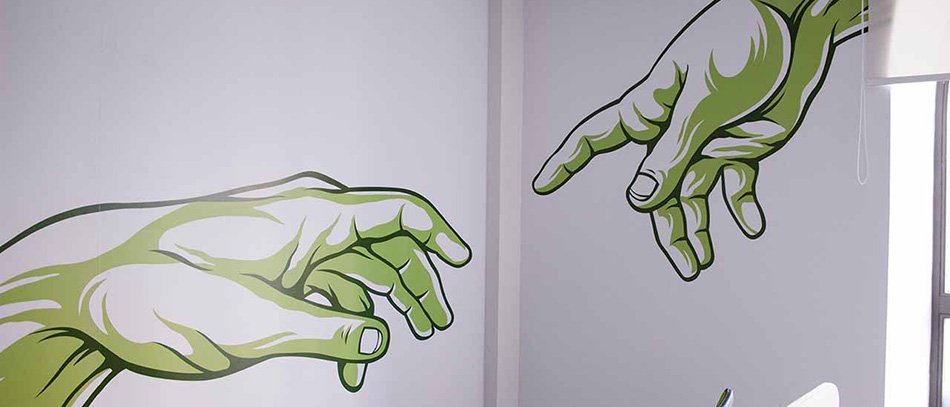
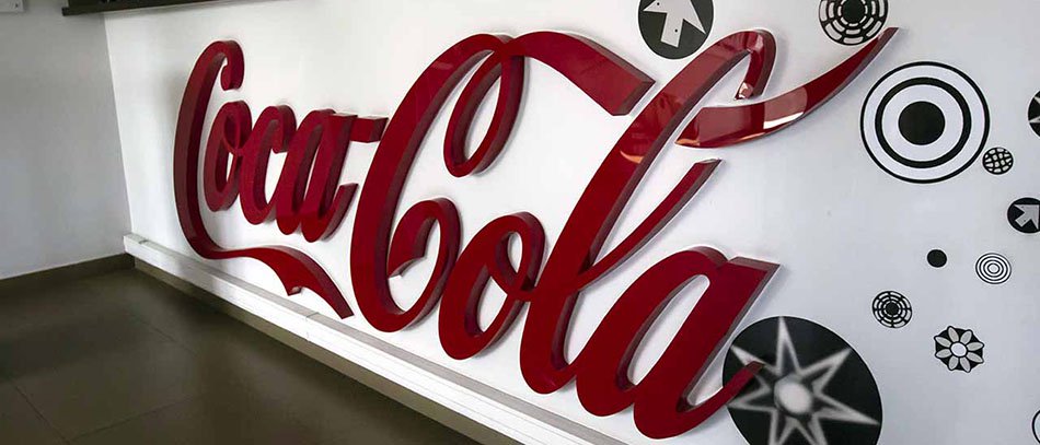
Red usually looks classy and elegant with the combination of black and white. The furniture in the office can be white while the wall decorations can be in red and black. This color combination can look especially good in a personal office. For corporate offices, you can combine red with blue or green to break the brightness of red.
Red – Black, White
“Red is the first color of spring. It’s the real color of rebirth. Of beginning.” Andie Condie
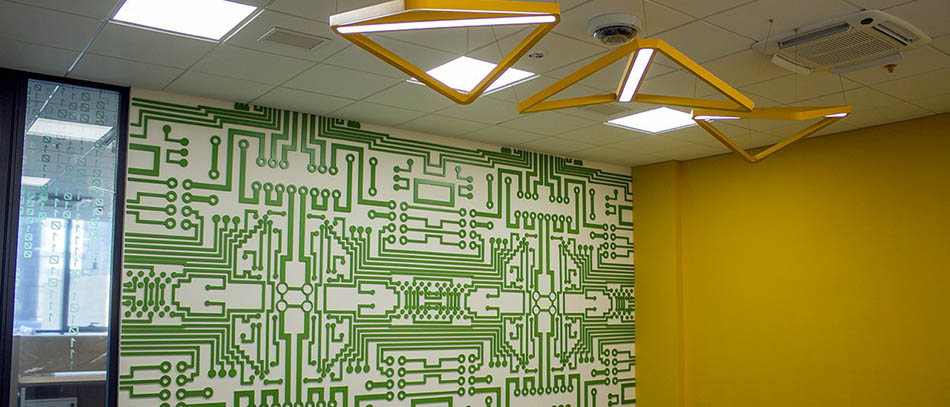
Yellow represents joy, therefore everything showing happiness is in yellow, like the happy face emoji. Yellow can mainly be combined with blue, green and red.
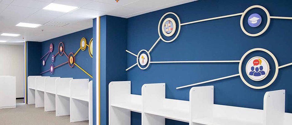
As this is considered to be a warm and an optimistic color, you can use this color in training rooms as it stimulates the mind especially when combined with blue.
Yellow is also recommended to use for graphics, 3D signs and other design elements in the reception area as it is a warm and welcoming color. These are the emotions that customers need to feel when entering the reception.
As too much yellow can be a little bit depressing try to combine it with one or even two of the colors mentioned above. Yellow and green represent nature and the sun, so if you want to have a relaxing atmosphere connected to nature, then use these colors for your custom signs and design elements.
Yellow can be used in the office kitchen as it is also considered to bring appetite especially when combined with red. So if your office is yellow do not wonder why you always feel hungry.
Yellow- Blue, Green, Red
Blue has the ability to reduce stress and anxiety, thus this is one of the most liked colors in the world. This color stimulates the mind and makes a person more productive. So it is recommended to use blue in corporate offices. Blue can be combined with orange and red. To have a more artsy office you can add abstract canvas prints and paintings in red and orange colors.
Blue – Orange, Red
“Blue is the closest color to the truth.” Steven Tyler
Usually, no one pays attention to the color of the ceiling but it can affect the person’s mood as well. If the ceiling has a brighter color than the walls it looks higher, but if it is darker it seems lower. As blue is the color of the sky you can paint the sky with clouds on the ceiling. This way workers spending most of their time seating in front of the monitors will have a piece of freedom inside their workspace.
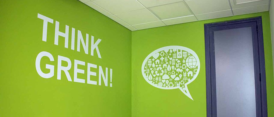
Green represents nature, health and wealth. This is again a relaxing color and will be perfect for corporate office areas. Green looks especially good with black, white and yellow. For instance, the wall in the office can be green while the decorations white. This will create a very calming atmosphere.
Green – Black, White, Yellow
“Green is the prime color of the world, and that from which its loveliness arises.” Pedro Calderon de la Barca
Black is an elegant and strict color. For brands black is associated with seriousness, luxury and formality.
Just like white, black can also be combined with any color. For office design, black and white can be a perfect combination but might feel too formal and boring. Thus you can add some small decorations in any other color.
Black – any color
“Without black, no color has any dept.” Amy Grant
In order to have diversity in your office design, it is recommended to decorate each room in different colors. And remember not to use too bright colors, as they can be tiring to the eye.
To have a better idea of how the color combination works, you need to understand the theory of color wheel. For more information about color combinations, you can find by reading “Brand logo design” blog.
