Comprehensive List of Signage Design Ideas to Boost Your Business
Without having a clear purpose for your sign, it will be difficult to find direction. Asking the right questions is the best way to create successful projects.
Table of contents
- Basic Considerations: Ideas for Signage Design
- Important questions for outdoor signage design ideas
- Stylistic cues for outdoor signage design ideas
- Great outdoor signage design ideas for your inspiration
- Beneficial hints for interior signage design ideas
- Wonderful interior signage design ideas for your inspiration
- Main steps for implementing signage design ideas
- Signage design ideas based on outstanding real-life examples
The best signage design ideas look simple to the viewer. For the designers, however, they’re much bigger than that and anything but easy. This comprehensive guide will help entrepreneurs with tips and advice on how to design a sign. Using these practical strategies will boost your brand.
Basic Considerations: Ideas for Signage Design
If you’re interested in business sign designs, this article is a perfect guide for you.
Important questions for outdoor signage design ideas
There are a few essential goals to consider when it comes to signage design. Here are the questions to answer before you start.
-
What’s the primary purpose of your signage?
The design depends on the goals you want to achieve with your business signage. For example, does the sign aim to:
- advertise
- guide
- warn
- relay information
- all of the above
By defining a clear objective, you’ll be on the right track towards indoor or outdoor signage design ideas.

-
What kind of audience do you need to attract?
Your target audience is one of the first points of consideration for your design project. It’s also a great way to decide on sign features. Let’s see some examples:
- If you’re going to advertise clothes for the youth then your signage should be colorful, creative and whimsical.
- If you’re selling products for fashionistas, entice them with modern and stylish details. Use pink to exude love and femininity.
- If your business building signs are for professionals in their forties, then use black or bold designs for your brand.
Note that in marketing, black is used to signify luxury and glamour. Combined with golden hues, it expresses opulence and exclusivity. Be sure to research color psychology so you can elicit the desired effects.
-
What’s the secondary goal of your signage (if any)?
Your signage is bold, bright and catchy. But besides visual appeal, it can also serve a functional purpose. Additional point to keep in mind:
- Why not add your address and contact information to spare spaces? Connect people with your business along with raising brand awareness.
- Hit three birds with one stone! Besides displaying your brand and contact information, make the sign medium a utilitarian one like an ATM machine.
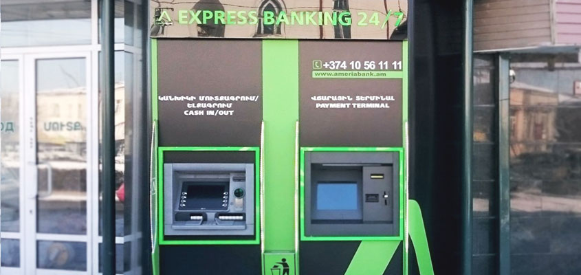
Now that you know the answers to these questions, you’re on your way to creating remarkable signage. So keep them things in mind before we move on!
Stylistic cues for outdoor signage design ideas
Below, you’ll find formatting suggestions for creating impressive sign designs. Included are technical highlights such as right contrast, visual considerations and other tricks. Let’s check them out in more detail.
-
Make an impression in a few seconds
You only have 7 seconds to make an impression, especially with your window signage such as window decals. That’s the average time to get the attention of pedestrians and motorists passing by. Speak to the right people the right way and the results will knock on your door sooner than later. When deciding on the large format printing design for your graphics take into account stylistic elements like:
1. Contrast

2. Spacing
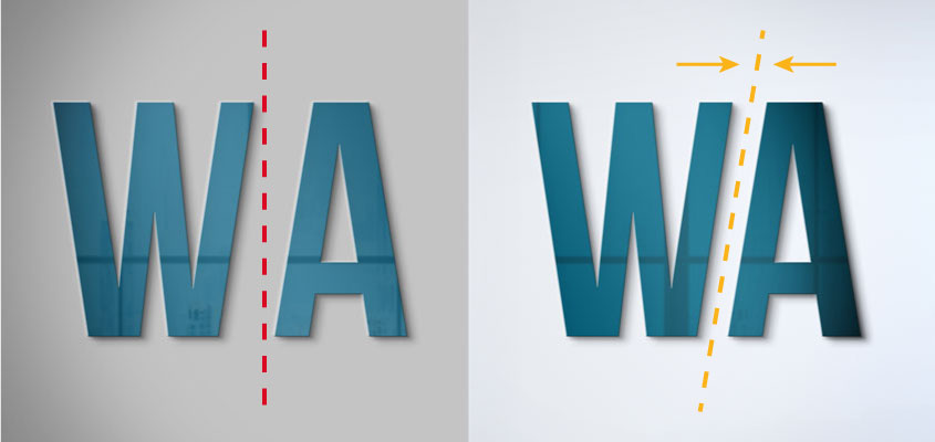
3. Fonts

To gain more insight into sign design, please refer to the following article: 11 Guiding Tips on How to Design a Sign for Your Business Like a Pro
-
Express yourself directly
Present your business without leaving any room for doubt. People should know right off the bat what you’re all about. If you need gym signs, then clearly list your services.

Avoid confusing visitors. You don’t want people coming in to buy sweets because of vibrant decor that doesn’t state a purpose.
-
Don’t overdo it with visual effects
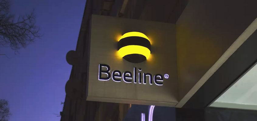
Creative effects such as lighting and three-dimensional scales are always popular. Just don’t go overboard with them. Clarity is key to the overall quality of your sign.
- Don’t be extravagant with lighting. It can look too flashy or cause blurriness, making it hard to read what’s written on the sign. Lighting should be used to highlight your message, not take attention away from it.
- Installing 3D signage in and around your premise is a good idea but don’t clutter them all in one place. It can be overwhelming to the eyes. Consider spacing them apart and pairing the dimensional signs with simpler types of decorations.
- Use appropriate sizes for the signage. The biggest scales don’t always indicate power and the smallest don’t always denote subtlety. Create harmony between the size of your sign and the placement site.
Great outdoor signage design ideas for your inspiration
Outdoor signage makes the first impression of your company. The importance of making the sign compelling cannot be overstated. Shop sign design ideas need to make a positive and lasting impact if you want customers. You can find ideas for the best sign board design for small shops and boutiques below.
-
Enchanting design ideas to get loyal customers
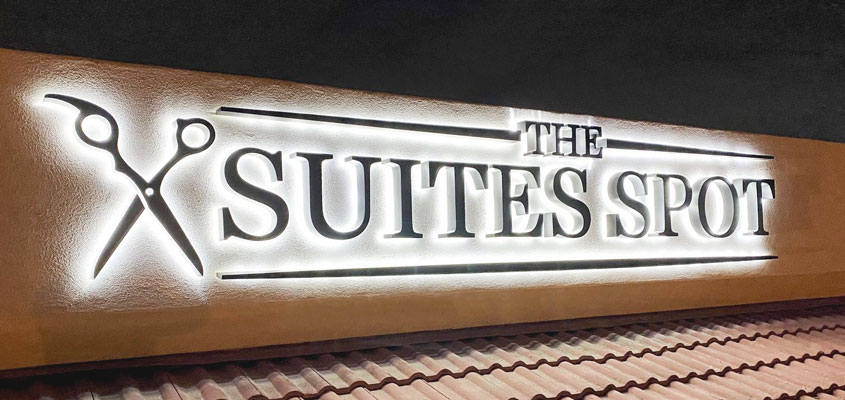
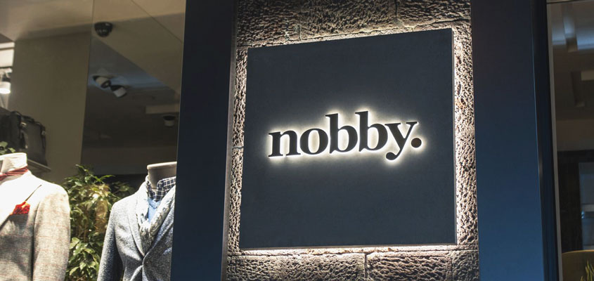
Pedestrians and drivers should both appreciate your shop sign design ideas. Tasteful elements, like backlit acrylic signage, will encourage people to trust you right away. Flexible in style and function, this combination of elements is a winning card for any modern business. It grants a distinct visual appeal to exterior as well as interior decor.
- Subtle lettering to add grace and elegance
- Strong background medium to highlight the text
- Sizable text and platform to give a bold appearance
- Good lighting to illuminate borders and features
-
3D signs to make the building facade more inviting
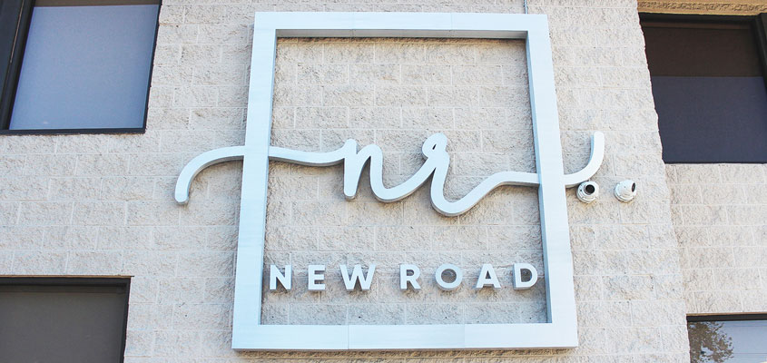
Sizable dimensional signs are often applied as fixtures on prominent parts of a premise. In such instances, channel letters increase visibility and enhances the overall look of the building facade. Keep in mind that feminine design elements like cursive letters make infrastructure look less intimidating, inviting customers in.
-
Creative signboard design ideas to keep people on track
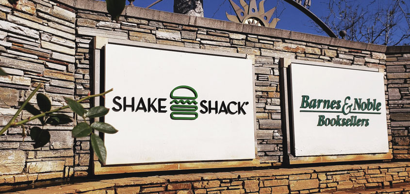
Turn your place into a dream with purposefully-chosen wayfinding signage. They’ll spread your business ethos and help guests find their way with ease. The more comfortable they feel navigating it, the more likely they’ll be to come back and stick around.
-
Memorable storefront decor elements to depict your identity
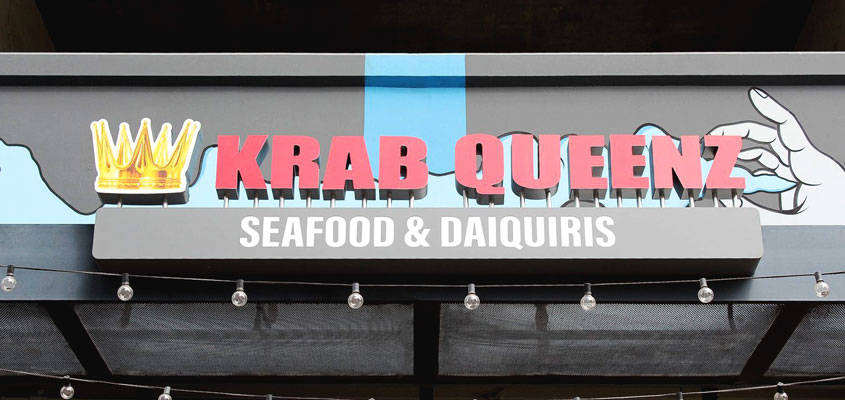
Signs on your facade are an excellent means of promotion for people on the go. They need to stand out. Using a pun or extra ‘Z’ can be the lucky charm for your storefront signage. Little jokes or deviations in spelling make your business more approachable and memorable.
-
Charming wooden decor elements for a natural effect
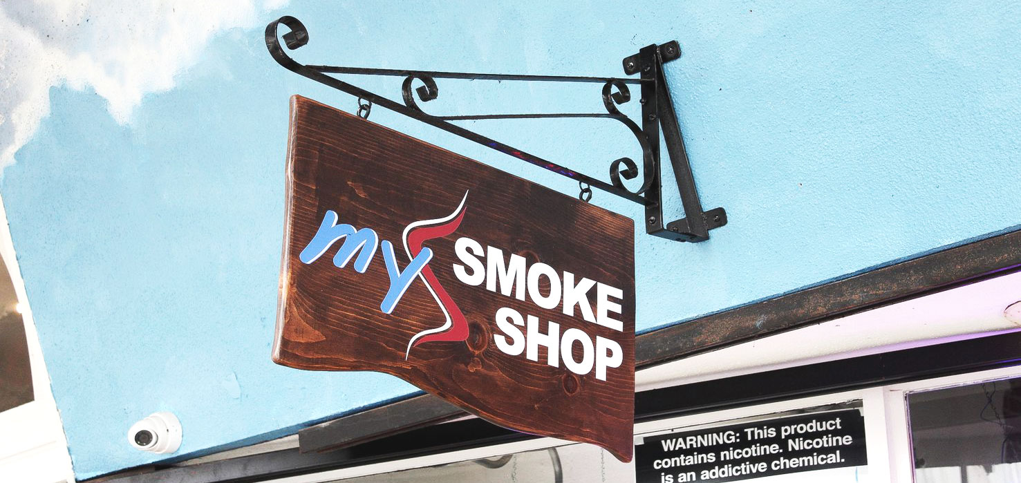
Wood is a fantastic choice for any design. It’s durable and distinguished. As in this hanging option here, it creates a stylish ambiance with little effort. Along with information, wooden signs can be used for brand identification. Whether for indoor or outdoor purposes, wood sign design ideas add a natural feel and eco-friendly rapport to buildings.
Beneficial hints for interior signage design ideas
Once you’re done with planning your outdoor design, take your time for a few specific interior signage design ideas that will raise the bar. Let’s have a look at vital considerations for your interior sign design.
-
Represent your company’s logo and slogan
Including your logo and slogan within your signage scheme is a surefire way to earn acclaim. It will send a direct message to your customers about your brand identity and services. The more unique it is such as in the form of halo-lit signs or reverse channel letters, the more it will enhance character and recognition.

-
Make a vision statement to showcase brand values
Besides exhibiting your trademark, add your core values or company motto. This way, you express your values right from the start. Transparency is valued and will encourage people to trust your brand.
-
Integrate beautify and functionality
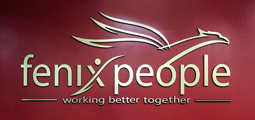
Go with a clean design on a durable sign medium. Gold lettering on a red wall will certainly add elegance to any space. Recognizable color schemes and purposeful use of space create unmistakable design elements.
-
Use distinctive elements for continuity
Connect different areas of the work environment by incorporating thematic artwork throughout. Depict your company’s colors along with fine office signage to add flair to your workspace. Cohesion is crucial for recognition as well as teamwork.
Wonderful interior signage design ideas for your inspiration
Advertising campaigns are excellent for boosting brand awareness but they must be paired with good signage. Compelling interior signs create an important image for your trademark. Here’s a list of a few inspiring interior sign design ideas to optimize effectiveness.
-
Attractive real estate decorations to charm customers
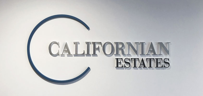
Outstanding features are the primary factor for keeping your business distinguished. Incorporating them into real estate sign design ideas will come in handy for creating an inviting atmosphere. Practical and pleasing, these elements will perfect your marketing efforts.
-
Illuminated lettering for space decoration
If you’re looking to make your company stand out, use light up signs for business. Striking and fully visible, these versatile office sign design ideas are used for their smooth-finish and stunning aesthetic. Often combined with light box sign displays they are used as lobby signs, working area displays and add creativity and flavor to any area of operation.
- Appealing embellishments for your trademark
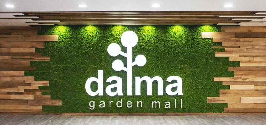
Embellishing sign elements change the ambiance of a space in a positive way. This is especially true when they’re applied to blank walls. Used in moderation, they will make your brand more visually pleasing.

Main steps for implementing signage design ideas
In the process of creating catchy design ideas, there are important stages for achieving noteworthy results. Let’s see several factors for creating successful signage design ideas.
1.Consider visualization as key to a stunning final look
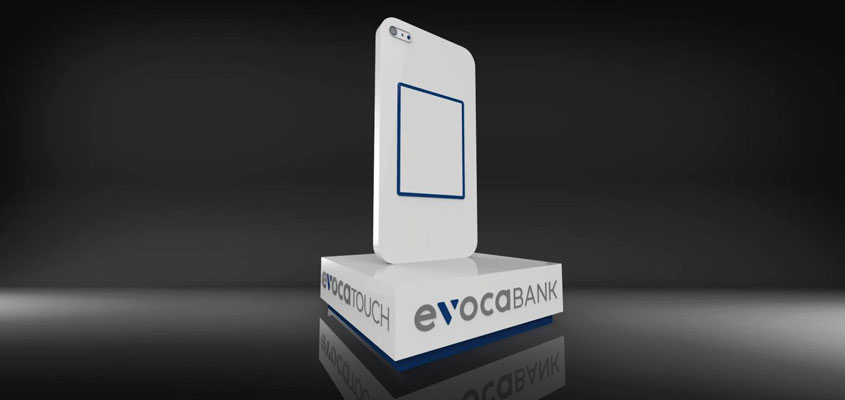
Visualization enables designers to show clients digital rendering of a final project before production. This way, they can evaluate it and make changes to the plan if need be. Compared to sketching, 3D visualization is also an effective tool for making your products look more realistic.
Related: What Is 3D Rendering? 6 Must-Know Basics About 3D Rendering
2. Choose the background and foreground wisely
Background and foreground colors and images are crucial for successful signage. Correctly selected contrast and color schemes will highlight your sign and make it more attractive. The same applies to trade show displays. Well-designed solutions will help drive more people to your stand. 3D rendering can come in handy for this process. Let’s see how!

- By keeping it clean!
This is a vital factor when choosing the right background and foreground combination. The surrounding should be as clean as possible for your subject to stand out in the frame. Direct attention by eliminating any distracting elements in the background.
- By filling the frame
Another tip is filling the frame, which means that no dead space is allowed in the signage design. Filling the frame doesn’t mean cluttering it with unnecessary graphics. On the contrary, it’s making sure the image in the foreground is sizable and the center of focus.
3. Choose a precise angle
Your signage is ready! But the installation is just as important. Defining the right angle is essential for making your signage noticeable, such having it face the flow of traffic. This is especially vital for outdoor signage. Then calculate the legibility by distance to determine the optimal range for sign positioning.
- Avoid installing your signage among or very close to other neighboring signs or else you’ll run the risk of going unnoticed.
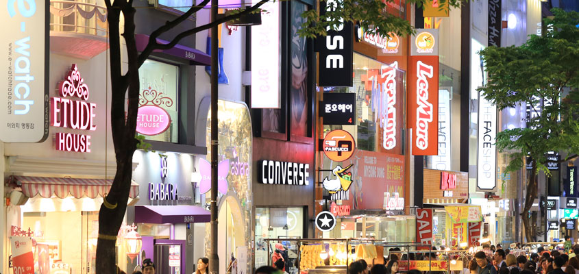
2. Adjust your signage placement according to the viewing distance. Experts recommend increasing your letter size by an inch for every 25 feet of distance. This will make it readable to passing drivers.
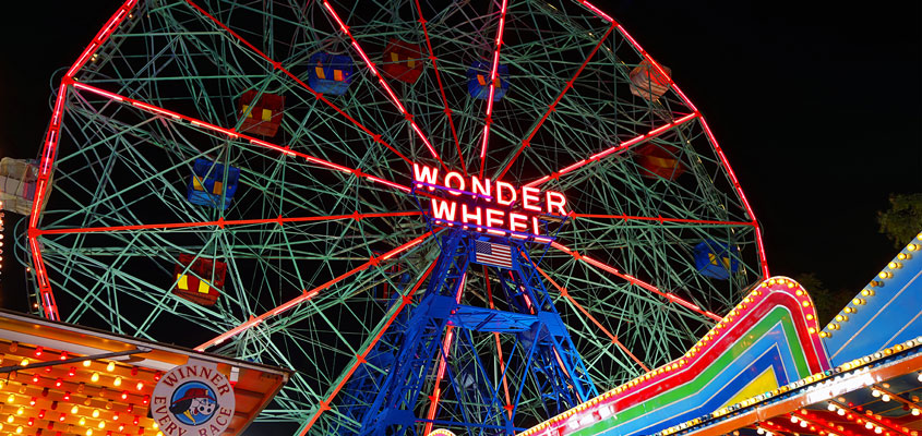
3. Install your signage against, not parallel to the traffic flow, to assure that it will get noticed. Positioning on a higher point will also make it easier to see. Pylon signs and high rise signs are good examples.
To learn more about visual sign making techniques, please read the following article: Comprehensive Guide On 3D Rendering Techniques And Tips For Experts
Signage design ideas based on outstanding real-life examples
After digesting the theoretical aspects of signage design ideas, let’s study some great real-life examples. As a leader in the sign making industry, Front Signs has realized projects for globally renowned companies such as Coca Cola, Los Angeles Times, Armani and more. In this section, we’ll go over top projects by us and other well-known brands. Let’s check them out!
Design and Fabrication Projects Carried Out by Our Team
-
Coca Cola
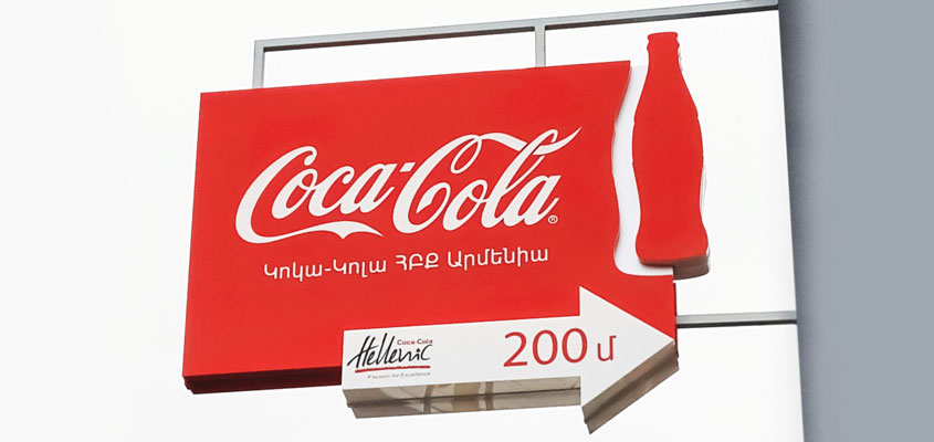
The crew at Front Signs worked night and day to get effective results on a project for Coca Cola with bold signage design ideas. The sign includes eye-catching shapes that depict the hallmark of Coca Cola. A stand out feature is their iconic bottle coming out of the side in a silhouette. The red and white contrast is pleasing to the eye and expresses the brand’s identity.
-
Los Angeles Times
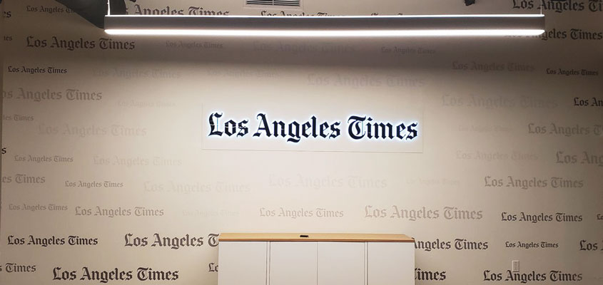
This vinyl sign design idea says a lot about the creative planning that goes into a project. The Los Angeles Times logo is clearly depicted with subtle texts decorating the negative spaces around it. These are reminiscent of the news coming in and out of view in time. They capture the essence of print media and the imagination of viewers alike.
-
St. Anthony’s ADHC
This sign was an elegant choice for a creative and professional local clinic. It showcases their unique logo next and brand name directly on the building’s facade. The sign design exemplifies beauty, depth and clarity.

-
El Clasificado
This carefully crafted design for El Clasificado packs a colorful punch with 3D letters and shapes. It’s made of robust materials that give clout to the logo. It simultaneously adds depth and a lightweight finish to the name. This custom signage provides skillful technical design along with information about the company. The combination adds dynamism with different layers and typography.

Famous Signage Designs We Admire
-
Mercedes-Benz
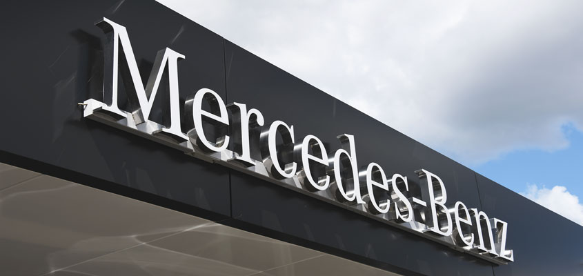
Mercedes-Benz made a distinctive signage statement with 3D lettering, further exemplifying sophistication and individuality. This bespoke sign catches the eye of every passerby. It adds bold character to the brand, taking style to a whole new level.
-
Microsoft
This is an excellent example of how to achieve great visual impact. The four windows of Microsoft use bright colors to maximize appeal and visibility. The sign’s placement takes advantage of structural nuances to represent the breakthrough enterprise. It explores new depths through multi-dimensional elements.

-
Apple
Simplicity is sophistication, especially when Apple does it. This is a signage masterpiece. As you can see, the iconic symbol of the brand is the only massive component of its design, giving it prominence and piquing curiosity from a distance.

Related: 9 Cool And Creative Sign Designs That Raise The Bar
It’s proven that successful signage is crucial for a higher level of accomplishment in business. Now you’ve got a comprehensive collection of design ideas to entice your customers. Get the most of them by contacting us with your vision now!
