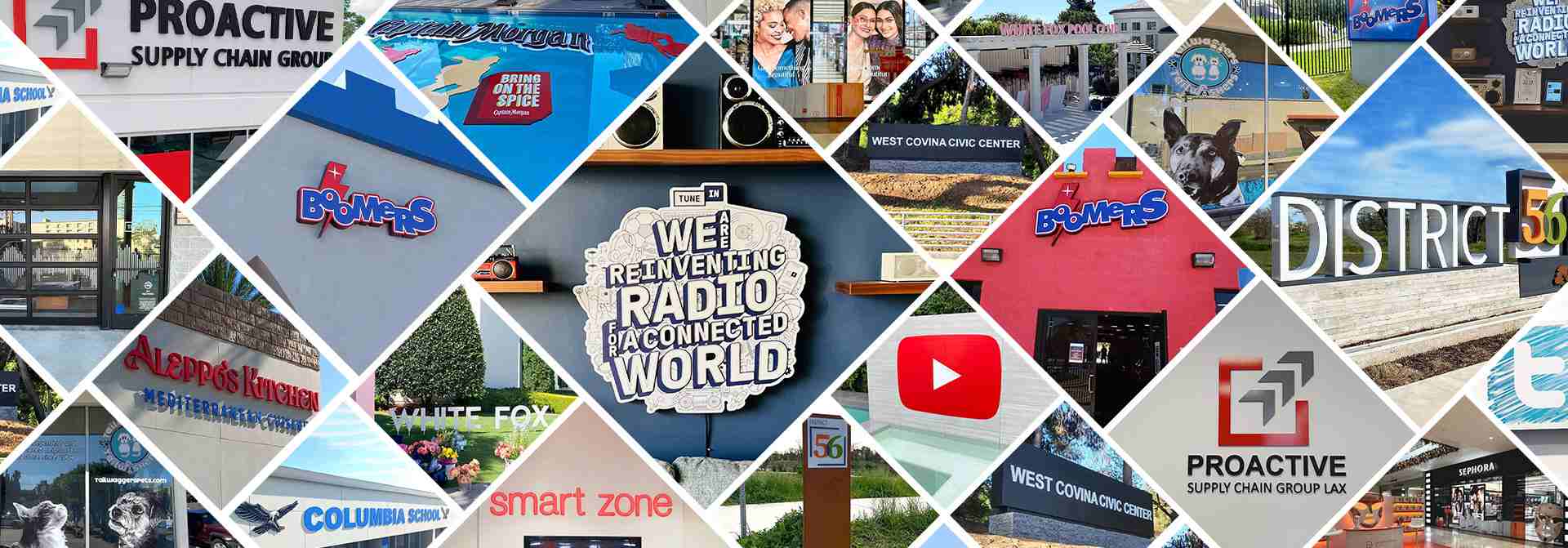
A Year In Review: The Best Corporate Branding Design Projects of 2022
Another productive year has drawn to a close, and it’s time to go over all that we’ve done. And with the end of this year, we’d like to share the most striking projects we manufactured every month this year. So let’s take a look at Front Signs’ best corporate branding design projects of 2022.
Table of contents
- Top Corporate Branding Design Projects from the First Semester
- 1. January: Corporate Branding Design Project for TuneIn
- 2. February: Branding Design Project for Engine Shop Agency
- 3. March: Branding Project for City of Elk Grove
- 4. April: Branding Designs for Proactive Supply Chain
- 5. May: Project Branding Image for Boomers Park
- 6. June: Corporate Designs for West Covina Civic Center
- Top Corporate Branding Design Projects from the Second Semester
- 7. July: Trademark Solutions for White Fox
- 8. August: Branding Example for YouTube
- 9. September: Design Project Solutions for Aleppo’s Kitchen
- 10. October: Design Project Example for Tailwaggers
- 11. November: Branding Design Solutions for Dr. Dennis Gross
- 12. December: Branding Designs for Columbia School
Top Corporate Branding Design Projects from the First Semester
Find the most successful branding solutions our sign making company manufactured in the first half of 2022 below.
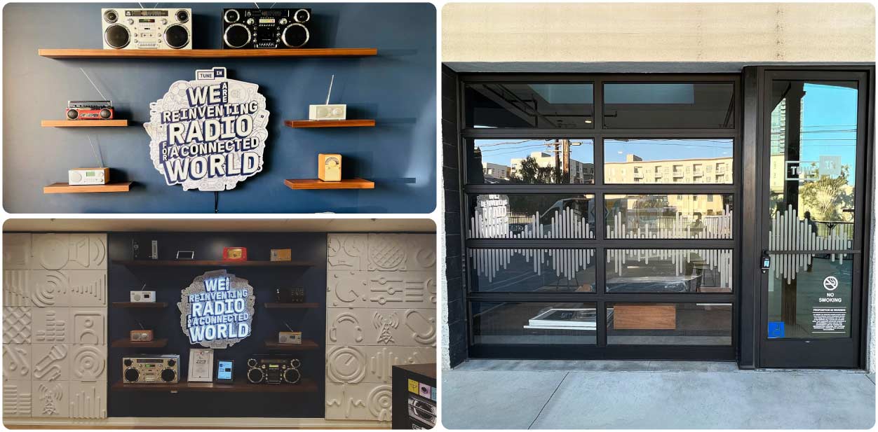
1. January: Corporate Branding Design Project for TuneIn
We created state-of-the-art interior design items for TuneIn at the beginning of this year. The project consisted of innovative logo signs with creative designs that established a unique character in the world of radio. Our light up signs for business showcased the company’s distinct personality along with structures made of engraved outlines of different items that have been installed by our skilled staff.
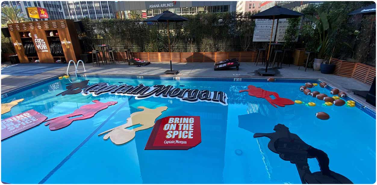
2. February: Branding Design Project for Engine Shop Agency
We take pride in the outstanding project our team completed for Engine Shop Agency with floating corporate event signage. We used foam-based elements to cover the entire pool with custom-cut shapes. Floating items create a sense of excitement, making them a popular choice for large events and public gatherings. Overall, the custom signage for Engine Shop Agency was a visually striking and effective way to promote the business and event.
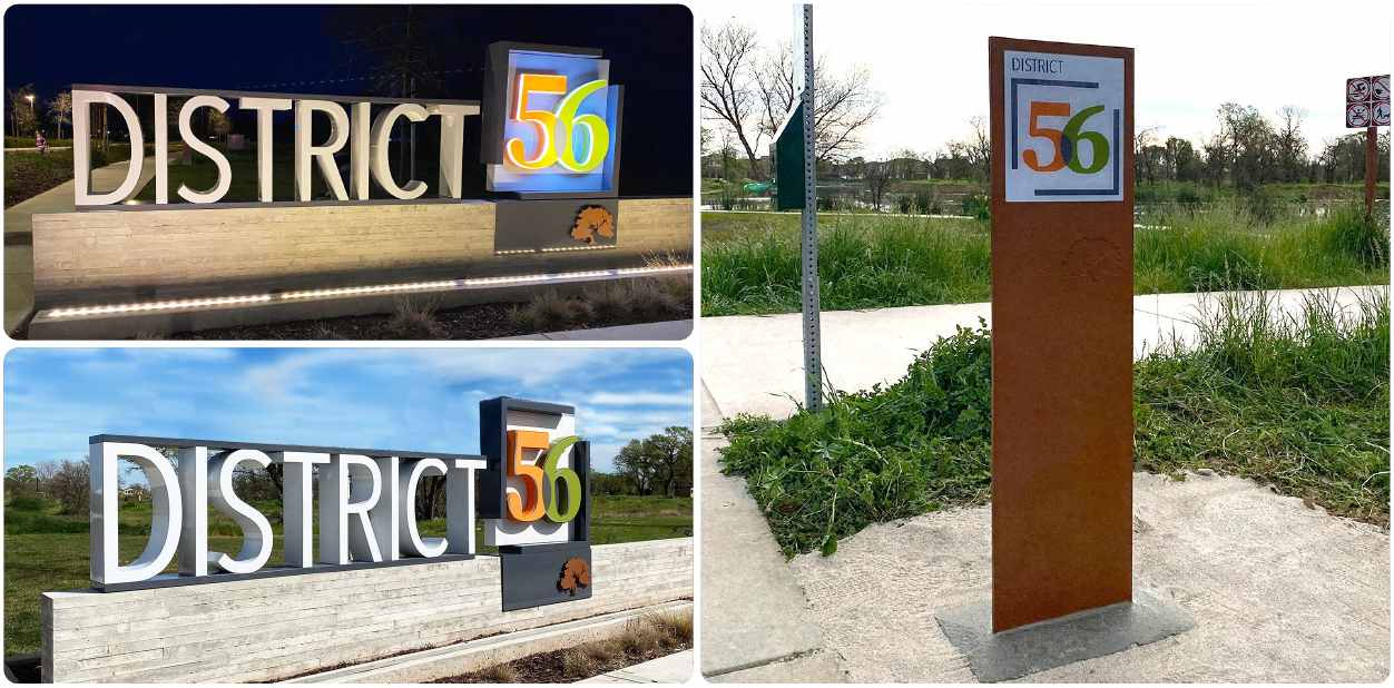
3. March: Branding Project for City of Elk Grove
This branding design for the City of Elk Grove is one of the projects we’ve done with exterior decorative media. This remarkable solution represented 3D letter signs made of lexan and aluminum with LED illumination. The large white letters spelled out the word “District” along with the number “56” in orange and green that’s easy to read from a distance. You can see the logo on the architectural signage made of bricks. This helped the brand reach out to the local community.
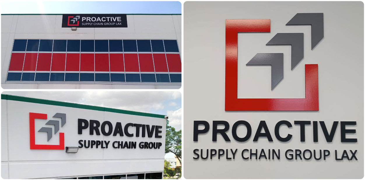
4. April: Branding Designs for Proactive Supply Chain
The branding design for Proactive Supply Chain was achieved using stunning building signs and intricate interior designs. We created a complete visual identity for an exterior and interior space that reflects the character of the organization. The project focused on the brand’s logo, color palette and imagery. You can see different application areas for the design elements including the windows, rooftop, walls and the lobby area.
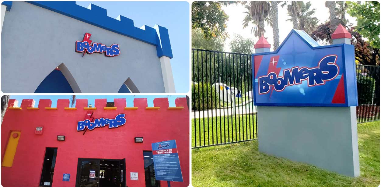
5. May: Project Branding Image for Boomers Park
We used different branding solutions to effectively promote and identify Boomers Park. The ideas included light box signs, free-standing media and other illuminated and lofty features that distinguish the park. Our professionals established a consistent visual aesthetic for the park by employing the brand color palette for all the outdoor signs. The park’s exterior area was branded using large patterns that help guide people through the premises.
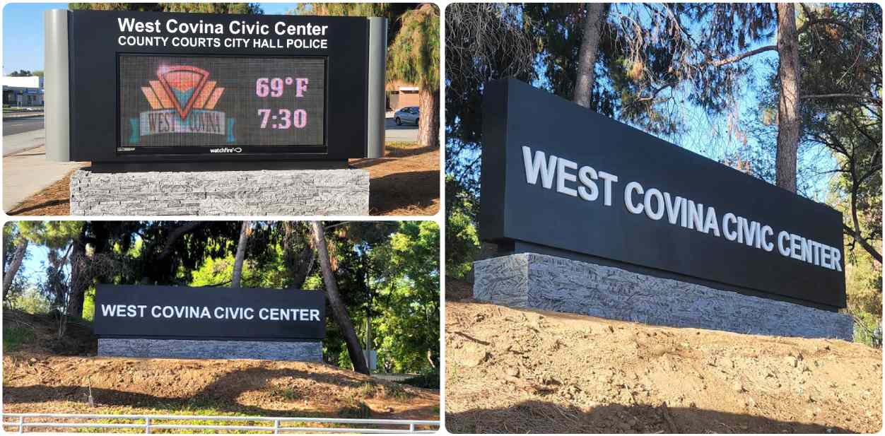
6. June: Corporate Designs for West Covina Civic Center
We completed a distinguished corporate branding design project for the West Covina Civic Center. The main component for the design plan was monument signs that provided a permanent presence for the business center. These solutions incorporated branding elements such as push through signs spelling out the company’s name with a readable font that captures attention from afar. They also relay important information such as the time and weather on a digital screen. We chose a classic design with a white brand name display on a black background installed atop the brick base.
Top Corporate Branding Design Projects from the Second Semester
This section outlines the top branding initiatives we completed in the second half of the year 2022.
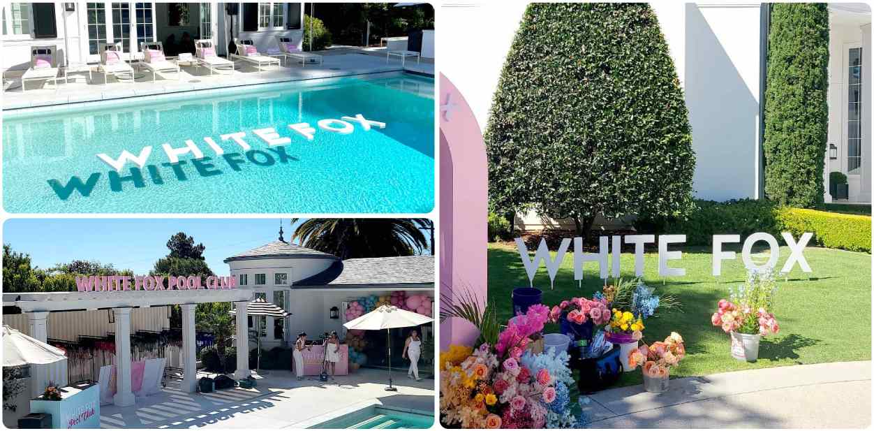
7. July: Trademark Solutions for White Fox
The classy and iconic corporate branding design project for White Fox was one of our star projects. Using pink as a primary color for branding the venue, we created a showstopper of a design for a summer event. We decorated the whole event area with different solutions. From the welcome arch to floating pool items, from free-standing items to rooftop solutions, each one was inspirational and created a sense of magic. The company name is fundamental for all business signs. It ensures that the brand is front and center at the event.
8. August: Branding Example for YouTube
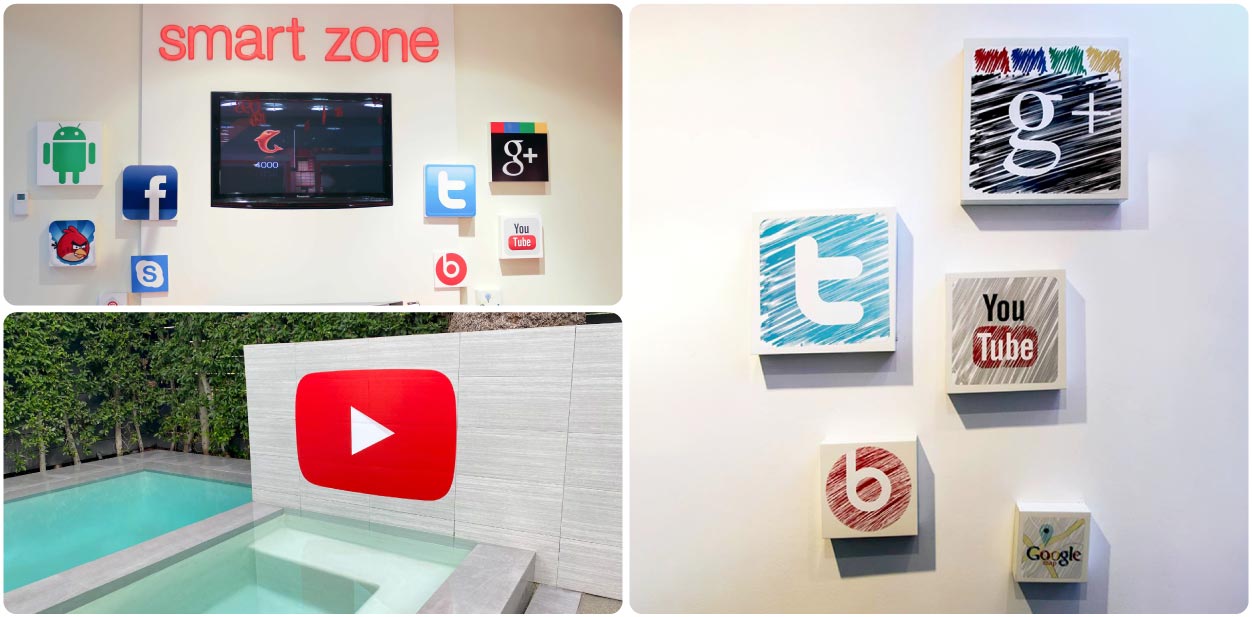
This outdoor branding design project with adhesive solutions in large format printing displayed the logo of our customers at YouTube. The outdoor designs looked amazing in their surroundings. They’re durable and long-lasting thanks to the opaque vinyl material being highly adhesive and the UV ink being sun and fade resistant. The wisely-chosen location was near the pool area which is popular during any event. The design was intentionally made identical to the YouTube logo. In addition to the design of the outdoor setting, we created interior designs featuring small social media icons including that of YouTube.
9. September: Design Project Solutions for Aleppo’s Kitchen
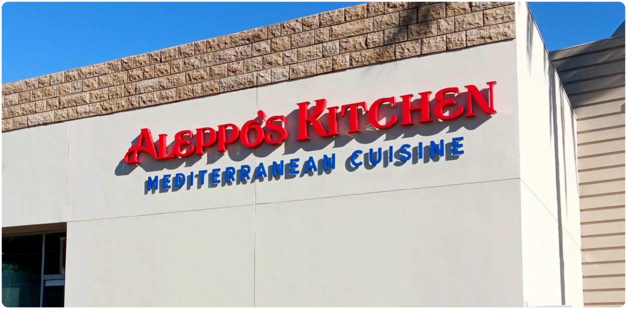
Designing a storefront for Aleppo’s Kitchen with restaurant signs was a fun and exciting experience. The display attracts customers and establishes the restaurant’s brand identity. We took the overall atmosphere and style of the restaurant into consideration while creating designs to make sure their branding reflects their unique character. The most appealing part of this project is the font of the channel letters which piques potential customers’ interest. This project captured the chic and polished brand identity. It was made of highly durable materials such as acrylic and aluminum that are resistant to the elements.
10. October: Design Project Example for Tailwaggers
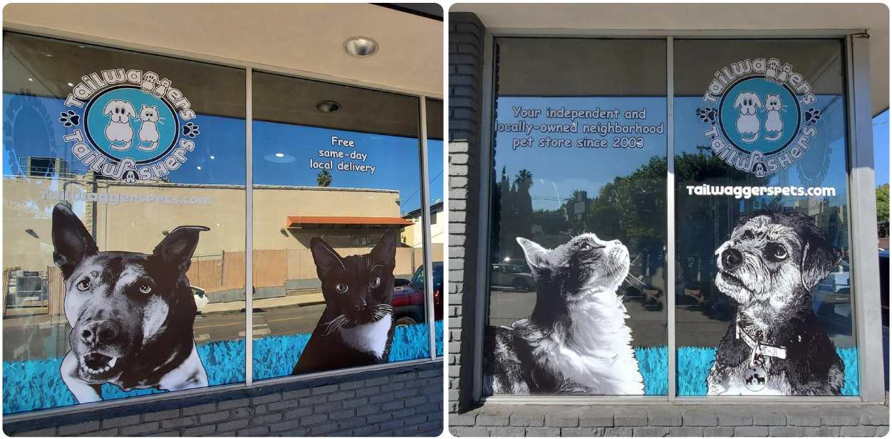
Creating a successful branding design for Tailwaggers pet store was an honor. This was a rewarding project that helped create an inviting atmosphere for customers and their pets. The promotional store signs which decorated the storefront windows were made to pull clients into Tailwaggers’ premises. The personalized design solutions were made of high-quality opaque vinyl material depicting the logo of the brand and images of pets. You can also see a short text about the store and its opening date with white vinyl lettering on the exterior window.
11. November: Branding Design Solutions for Dr. Dennis Gross
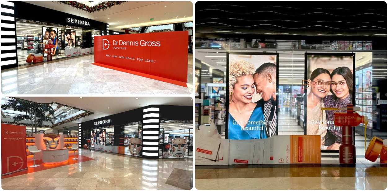
In November, we exerted our best efforts to launch an outstanding advertising campaign for Dr. Dennis Gross. Promotional interior signs help brands achieve a sophisticated look, and it was no different for this project. We also used custom decals to advertise this brand in highly-visible locations. We made it clear using concise language to keep it short and sweet. Simple, eye-catching designs are more effective at grabbing customers’ attention. We applied high-quality materials such as clear and opaque vinyl which would hold up over time.
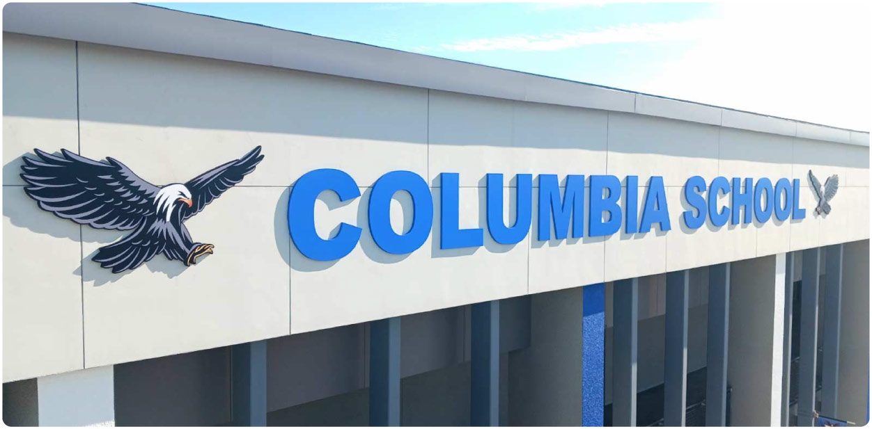
12. December: Branding Designs for Columbia School
We created the outdoor branding design for Columbia School with bold high rise signs. We displayed the school’s name on high-quality PVC material atop the building. Using large custom letter signs on a school entrance is a great way to add to the school’s visibility. We chose a clear font that would be easy to read from a distance. The size of the display was perfect for the entrance and was visible from far distances. The bright, eye-catching blue display was also great for attracting attention. The overall corporate branding design was completed using two large eagles installed on both sides of the school name.
It was our pleasure to design these branding projects for our clientele during 2022. You can check out the rest of the projects in our portfolio to see for yourselves that you’ll be working with professionals who can help create your own signage designs for all occasions. We can’t wait for the new projects that 2023 will bring with it.
