Brand Logo Design
Lily Travis
Your logo might be the most crucial factor ensuring whether your business becomes a major hit. Designing it is one of the first steps you have to take when kicking off your branding efforts. Here’s why:
Table of contents
The Importance of Brand Logos
Your logo is the mark of your brand. It has to be carefully and intelligently designed. It has to be impressive enough to hook your potential customers and memorable enough so they can easily recall it.
The Importance of Logo Design
It has to attract the attention of potential customers and convey your message quickly and effectively.
Your logo will appear on different surfaces and locations from building signs, large logo signs, banners, pylon signs and window decals to business cards, stationery and other promotional materials. We offer supreior quality of large format printing to make your logo appear in the best possible way. Keep in mind that it has to be equally effective and comprehensive in any size. It may appear on massive stadium signage or any other kind of event signs if you ever become an event sponsor.
Your logo may contain colors, graphic elements and texts. However, you don’t have to have all three to have a successful logo. Often, less is more. For reference, you can look up globally recognized logos, many of which have no text but work perfectly.
You should be particularly mindful of the color pallet of your logo. Colors on your 3D logo signs can make it stand out in the crowd of other logos around and give it a competitive edge. The unique colors of your logo should be powerful enough to distinguish your brand.
Color Palette of Logo Design
Since we know already that the right color pallet for a logo is essential, let’s see how to choose and combine colors.
First of all, we should check color theory to understand the psychological effect of each hue and their combinations. Then, select colors that match the mood and nature of your brand and services. Next, let’s examine the color wheel and mindfully select the colors. Eventually, we can combine them into complementary, analogous, monochromatic or other matching schemes to end up with logical and impressive color pallets. We’ll get into more details about this coming up.
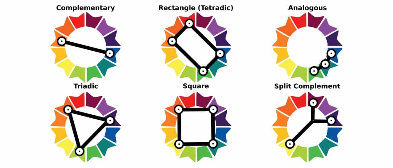
In the graph below, 6 color wheels are represented. On each of them, one strategy of combining matching colors is represented. But first, note that we can divide the colors on the wheel into two main groups; warm and cool.

All About Brand Logo Design
The first color wheel represents the complementary color scheme where two colors opposite each other create a pleasant match for the eyes. They create a high contrast to make your logo or custom sign pop out. However, the combination of these colors is very bold and should be handled with care.
Next comes the rectangle color combination strategy. This is a strong combination of four colors (two warm and two cool) and works best when one color is dominant.
We have the analogous color combination method as number three. This one suggests using colors displayed on the color wheel that are next to each other. It makes for a harmonious and comfortable color pallet. Take note that its effect is subtle so consider starting with vivid colors to ensure there is enough contrast. One color should be dominant, the other should be in a supporting role and the third can be used as an accent color.
Number four represents the triadic color combination which matches three colors evenly displayed on the color wheel. In this case, the color combination can be boisterous so one color should be chosen as the dominant and others used as accents.
The square color combination strategy is represented in the graph under the number five. This strategy chooses two cool and two warm colors evenly displayed on the color wheel. Here also, one color should be dominant and a balance between the cool and warm colors should be established.
Last but not least, the split complementary color scheme is represented under the number six. This strategy also has high visual contrast yet less tension.
Take your time and play around with the colors based on the information above. Remember that color is the most powerful element on your logo. It must therefore be taken into serious consideration. The logo of your brand is the face of your company so give it your full attention and others will, too.
