11 Guiding Tips on How to Design a Sign for Your Business Like a Pro
Designing signage is as important for the success of your brand as it is challenging to figure out.
Table of contents
In this article, we’re going to explore 11 guiding tips on how to design a sign to entice customers.
You’ll also learn about 3D product rendering and the difference it will make to the overall appearance of your business signage.
Tips on how to use sign design elements for bold results
Sign design elements incorporating artistic and scientific principles will make your business stand out from the rest. From powerful exterior signs to warm lobby signs, you’ll need to utilize a range of techniques to make your signage perfect for your brand identity.
Here are tips for sign design elements to consider so you can lure people in.
Tip 1. Assess the proper typeface
There are factors to consider while selecting the text for your business signs.

- Fonts: Avoid cursive or novelty styles. Consider the use of letters in bold format to highlight your message.
- Sans serif is the most legible font even while driving.
- Make text big enough to see from a strategic distance
- Don’t mix different fonts on one sign
- Avoid writing letters in all caps
- Letters: Ten inches of height are recommended for each one hundred feet of visibility.
- Words: Put a maximum of fifteen words on your sign. Go by the three by five rule:
-
- 3 lines – 5 words
- 5 lines – 3 words
Tip 2. Focus on image resolution
If you’re wondering about how to design a business sign, let’s dive in a little deeper.
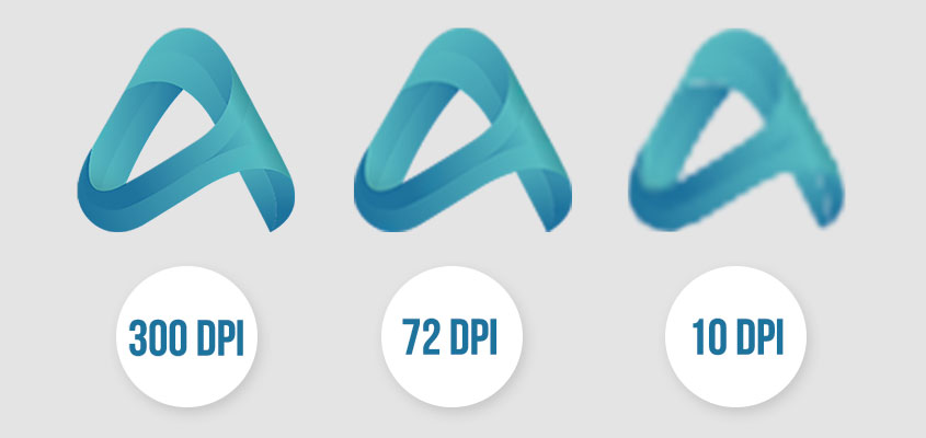
There are three factors that play an important role in determining image resolution – viewing distance, viewing conditions and image type. Now let’s get into more detail:
- Viewing distance
The visual acuity of our eyes is for discerning the details. For maximum visibility, the angle is a prime factor. The sharpness of view diminishes as viewing distance increases.
There are standards to determine how far the viewer can stand to still notice details. The first thing to consider is the distance from which the final product is meant to be viewed. You don’t need the same type of graphics for door name plates and stadium signage. For example, the larger and more eye-level the sign, the farther the viewer should be to take in its full effect.
- Viewing conditions
The next point to consider are the conditions under which the image will be viewed. Take into account all the visual and moving features within the viewer’s frame of reference.
If you think about how to design store signs, then you’ll get an idea of how it may need to be lit and what resolution will be optimal for the graphics. For car wraps on the other hand, the resolution is not that critical since the vehicle will be in motion under constantly changing lights.
- Image type
The overall image itself is important when it comes to the question of how to design a store sign. If it’s a soft-focus picture with a long viewing distance, lower resolution files between the range of 72-200 dpi are acceptable.
If you do need to highlight fine details on the image, apply higher resolutions like 300 dpi.
Related: How to Make a Business Sign: Factors to Consider in 2021
Tip 3. Stay attentive to borders
Borders significantly improve the visibility of a sign. They grant prominence to its appearance and emphasize a bolder expression.
Sign borders contribute to reading speed immensely. The advantage of using borders is that they naturally guide people’s eyes so they can concentrate on the message.

Tip 4. Carefully select the material it’s printed on
Your custom signage material makes an impact on the choice of every other detail along the way. The medium varies depending on the purpose and type of the sign. You can’t use the same materials for light up signs and non-illuminated graphics.
Since our main focus is on how to design a sign for your business, let’s hone in on which materials are best for this type of application.
Material 1. Acrylic
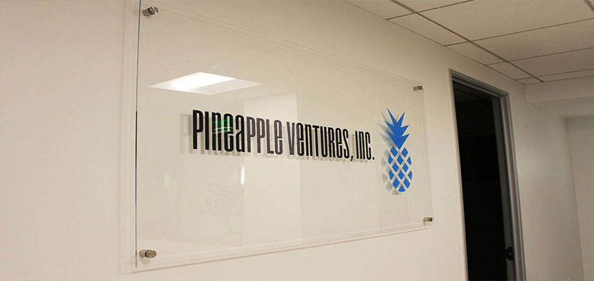
Why consider acrylic for your enterprise signage? For one, because of its versatility for both outdoor and indoor usage. It’s also flexible, so acrylic signs can be easily cut and routed, streamlining the sign making process. This yields a relatively low cost for a high-end look. The material is used for a range of solutions from small door name plates to bigger light box sign displays.
Material 2. Aluminum
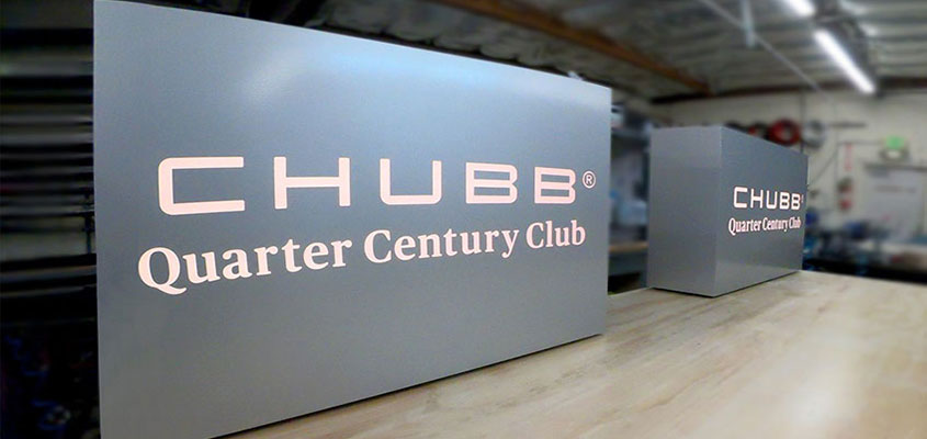
It’s no secret that every notable business sign needs to endure the test of time. Due to its extremely durable nature, aluminum is considered one of the best materials for outdoor signage like building signs or pylon signs.
Material 3. Coroplast
Consider this medium for both exterior and interior signage. Cost-effective and lightweight, coroplast can resist harsh weather conditions and it’s completely waterproof.
There are many more substrates available for signage so be sure to check them out under our products category.
Tip 5. Be intentional with color
Understanding and properly applying color psychology will be a determining factor in whether a customer purchases your product or not.

Colors have a subconscious effect on the perception of different target audiences. Before selecting colors for your signage, learn about the psychology of each color and how they impact people’s choices. Then pick the ones that will suit your brand and intentions.
As a general guideline, keep in mind that:
- Yellow usually conveys cheerfulness, happiness and extraversion.
- Red is said to instill a sense of energy, strength and power.
- Green often has a cool and refreshing effect.
The upside is that you’re free to play with the different tones of your chosen color. For instance, try brighter shades of yellow on outdoor signage for a noticeable boost in traffic.
Once you have clients walk into your premise, keep a consistent color theme. At most, alternate between different shades and tones to make sure your customers understand your vibe and don’t get overwhelmed.
Tip 6. Create a striking contrast
After having carefully selected your hues, step into the second phase of the design process. Applying the appropriate color contrast will eliminate the risk of your signage going unseen.
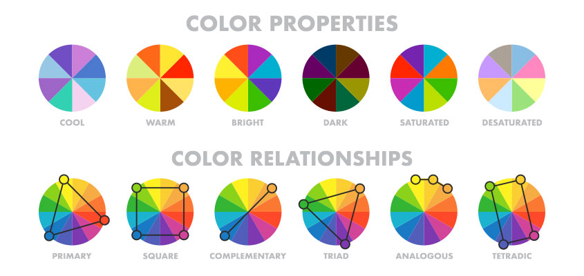
For achieving the desired effect, choose colors that are contrasting both in hue and value. Good examples of high contrast colors are yellow and black, white and black, yellow and blue, and blue and white.
Low contrast combinations are usually on the analogous spectrum like blue and green, blue and black or any other combination of hues that are similar to one another. This can be avoided by adjusting the darkness of each shade.
For more color combinations, check out this color wheel.
Tip 7. Limit your words
Explain all the services you offer with as few words as possible. Wordiness will mesh with the image, resulting in undesirable reactions. Be concise.
You have 2-3 seconds to attract an audience. Leave 30-40% of your signage with “white-space” for good readability.
Want professional signage design? Contact us!
How to design a business sign: tips for the pre-manufacturing phase
The first impression is crucial. Vivid 3D signs with well-balanced graphics are sure to make a good impact.
These are four basic tips for how to design a sign to leave a positive mark on your target audience.
Tip 8. Visualize the final look
3D rendering is one of the most effective ways to visualize your product before it’s made. This practice is applied to creating all kinds of signs prior to fabrication.
It’s not only useful for visualization purposes but can also help to determine the all-inclusive cost of production. This way, you can get an accurate quote before making a decision.
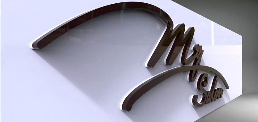
Another goal for the 3D depiction of signs is for positioning purposes. The model shows how lights hit the object from various angles in a specific location. You essentially get the final look of a sign before getting it manufactured.
Related: What is 3D Rendering? 6 Must-Know Basics about 3D Rendering
Tip 9. Use modern technologies for advanced results
Save time and effort when creating a landmark in your community. Effective signage is easier to prepare when using modern technologies for design, production, large format printing, sign installation and other processes. These tools make the preparation process quicker and more cost-effective.
- 3D printing technology to create concept models
This technology has come a long way in recent years. It’s pushed to new realms with promising applications for the signage industry. Using this technique, you can create unique 3D designs with vivid colors.
- Digital signage technology for interactive adverts
This fast-paced sphere of technological sign creation is replacing many traditional methods. It signals the growing importance of cutting-edge tools on the market.
Digital signs are no longer just visual platforms for advertising. They’re live and interchangeable, creating interactive experiences for users.
These are the essentials you’ll have to consider while creating your signage in the current era.
Related: Comprehensive List of Signage Design Ideas to Boost Your Business
Bonus Tips: How to design a sign for your business to be first at the finish line
Below, we’ll cover two more bonus tips on how to design a business sign. Let’s have a look through.
Tip 10. Consider Location
Along with all the points mentioned previously, the location of your sign is a key factor.
- Carefully consider the prime location and positioning of your signs. Will you opt for designs hanging from the ceiling, monument signs on the ground, pin mounted letters on a wall, signs wrapped on a vehicle, or trade show displays set up at corporate events?
- If you choose to hang it, the maximum length of your sign should be ~20 feet to optimize viewing distance in public areas with a lot of infrastructures.
- When utilizing sandwich boards or freestanding directional signs as guides, make sure they’re placed in a hotspot for people to spot them easily. High-traffic areas and intersections are a good example.
- Wraps on vehicles should have a bold but simple look for best readability while driving.
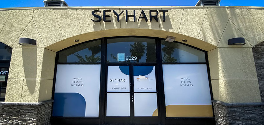
You may also need to review local rules and regulations in regards to the location as well as other specs of your signage. Be sure to check them and obtain sign permits (a service we offer) when necessary before initiating the installation process.
Tip 11. Trust your sign design professionals
It’s great to have everything planned out in your mind! Next, you’ll need a professional crew to implement your vision. Be sure to contract experts to turn your concepts into reality the right way.
The best advice on signage design and manufacturing will be based on successful prior experience. A sign company with a rich portfolio of signage projects can help you determine the ideal material choice and other elements to ensure quality and accelerate production. Besides that, you’ll be given a wide range of stylistic variants depending on price and the goals you want to achieve.
Implement this guide and you’ll be guaranteed a successful business sign.
If you want to entrust your signage design to top professionals in the field, contact us!
