Pharmacy Design Styles Throughout History
The design of a business is an indicator of its proficiency. Pharmacies are no exception. The practice of healing physical ailments dates back to ancient times. Since then, pharmacies have undergone massive transformations. These changes include their exterior and interior design.
Table of contents
As a popular sign making company, we’ve compiled a list of old and new pharmacy design trends. Browse them for inspiration and create an ultra-modern pharmacy design using custom business signs.
Old and New Pharmacy Interior Design Trends
A pharmacy is more than a store that sells medicine. It’s a bridge between illness and health. Interior designers pay a lot of attention to the indoor layout of these establishments. The environment can make customers feel either comfortable or anxious. It’s important to be mindful of the layout and design of stress-inducing places.
1. Interior Openness
Old retail pharmacy design is infamous for its uncomfortable interior layout. Drugstores used to be crammed into small indoor spaces. Pharmacists placed medications out of sight or behind glass cabinets that were inaccessible to customers.
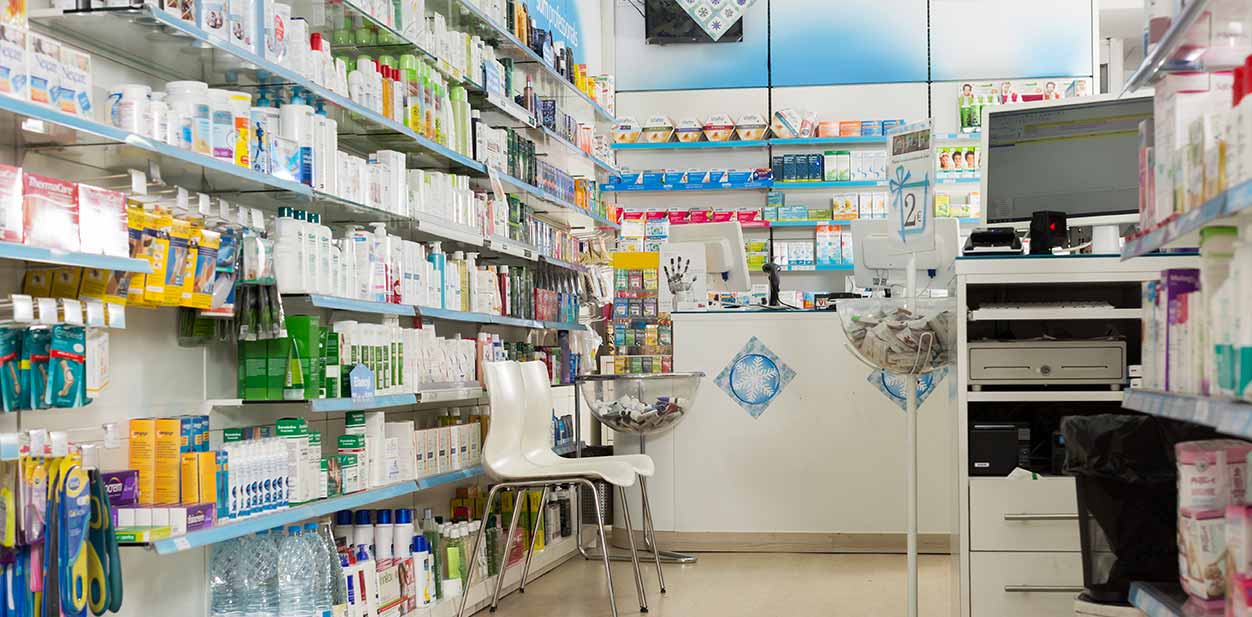
Modern pharmacy interior design solutions don’t pose such problems. Today, most pharmacies are spacious, organized and well-lit. Most counters are open and accessible. People can freely navigate inside the space or use seating areas while they wait. Over-the-counter products are easily available to all customers. They’re grouped and labeled with pharmacy interior signage such as custom letter signs. Some products are even promoted on island stands that are strategically placed.
2. Wall Colors
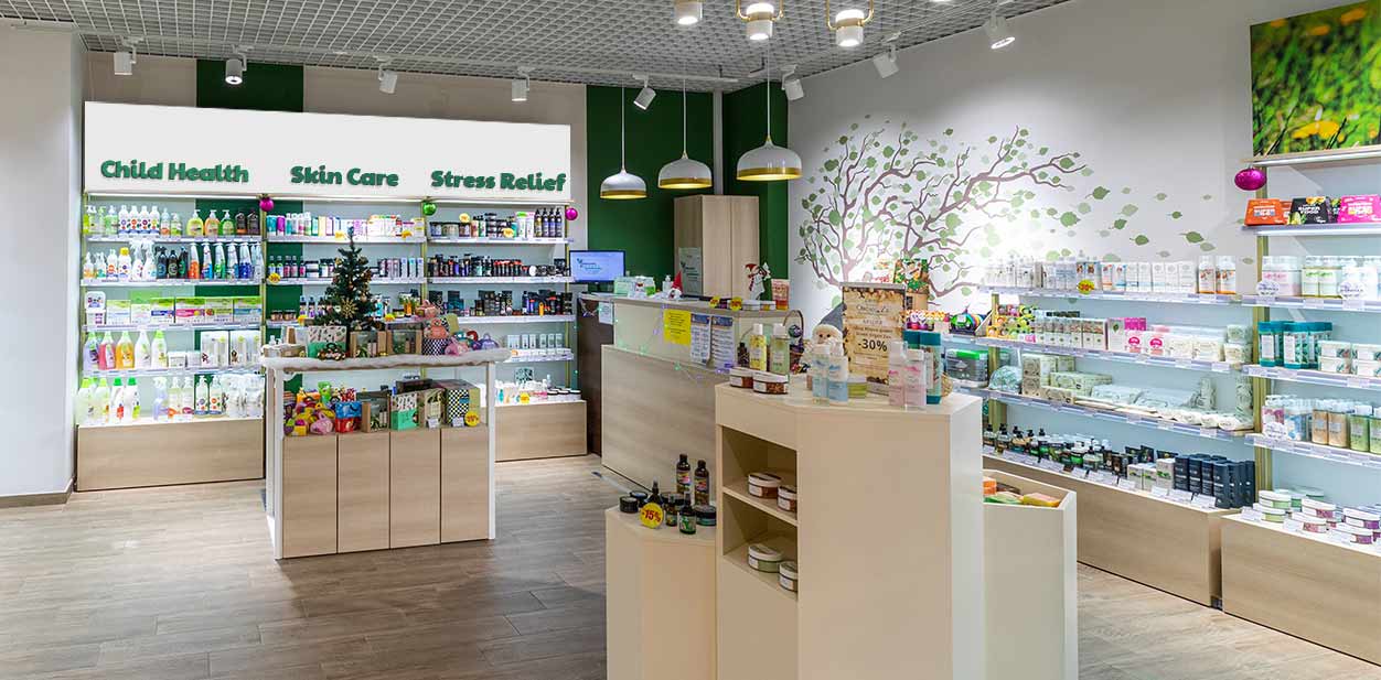
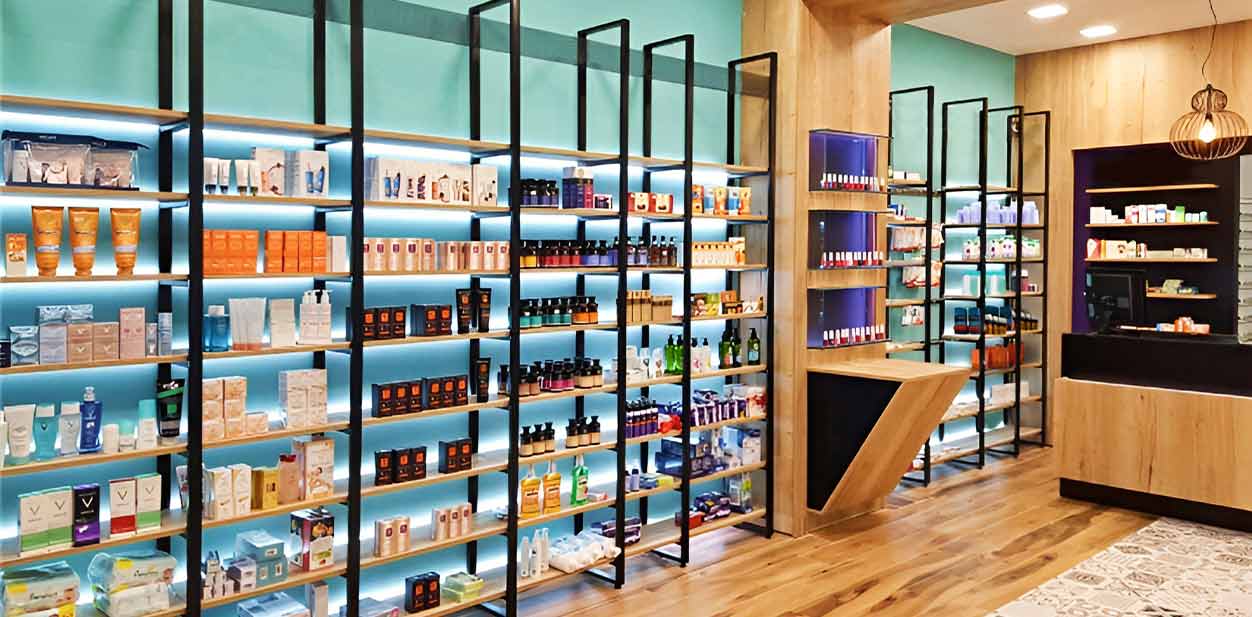
Colors used for pharmacy interior design have varied over the history of drugstores. Customers often form their first impressions of a brand by picking up on the interior wall colors. These tones have even been observed to affect shopping habits. This is why it’s important to pay attention to indoor color schemes.
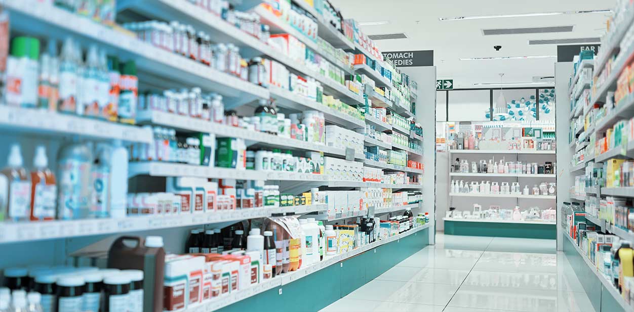
The healthcare industry has relied on standard medical colors for a long time. These tend to be blue, white and green. They’re thought to set a clean and harmonic ambiance. Modern pharmacy interior design, on the other hand, allows us to decorate with new colors. Earthy hues and bright colors are widely used today. Replacing cold tones with warmer ones can put customers more at ease. Custom decals for walls and ceilings are also popular in contemporary retail pharmacy design styles.
3. Indoor Illumination
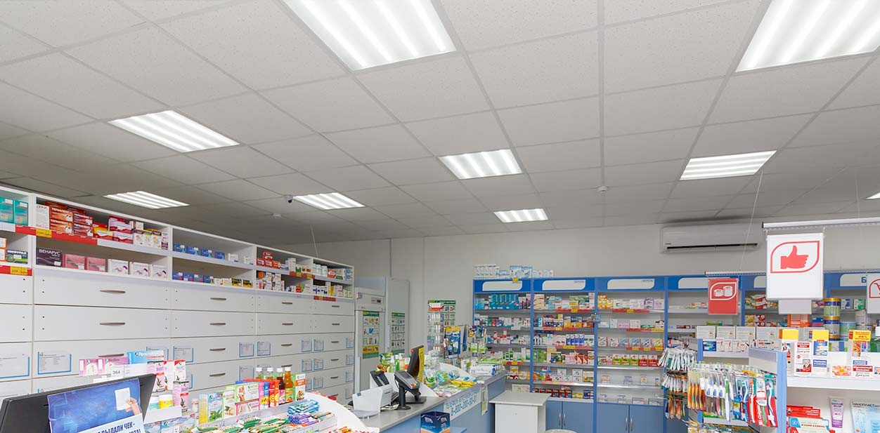
Lighting is another integral part of retail pharmacy design. Healthcare settings and pharmacies usually light their interior with fluorescent lights. However, most people are put off by this cold lighting effect. It’s even been shown to cause emotional fluctuations.
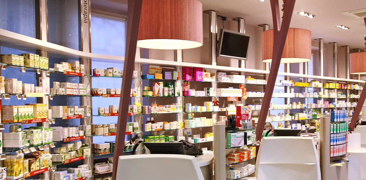
Modern pharmacy interior design remedies this with warm bulbs that cast a cozy light. Soft illumination creates a relaxed atmosphere and makes customers feel calm.
Old and Modern Pharmacy Exterior Design
Pharmacy exteriors aren’t used for selling but they do help to promote sales. Read on to find out what has changed in modern pharmacy exterior design.
4. Facade Decor
Floor-to-ceiling or “herculite” doors are a marketing tool that has been used for centuries. They’re usually made of glass to allow sunlight to enter the building and fill it with natural light.
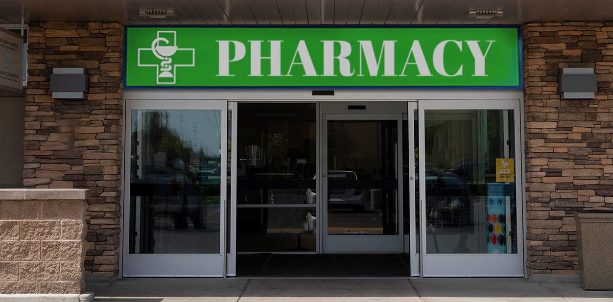
We can also see modern pharmacy design with stone walls and perimeters. They grant a rustic look while protecting sensitive products from direct sunlight. This design provides a great facade for setting up various building signs. You can also explore other custom signage solutions for additional decorating and branding ideas.
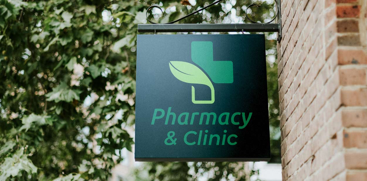
5. Outdoor Advertising Displays
Old-school pharmacy boys used to go around and stick advertising posters to neighborhood walls to promote products. This technique is a thing of the past.
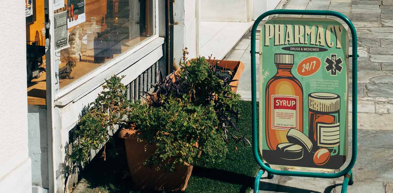
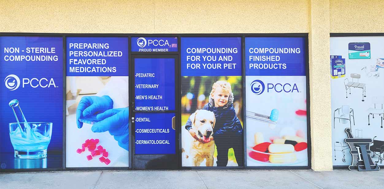
Modern pharmacy design implements sophisticated methods of advertisements and branding. Nowadays, we see pharmaceutical promos on a number of modern signs. They range from illuminated wall and window displays to prominent high rise signs.
Pharmacy Signage Design Upgrades
Medical office signs don’t just guide people to the proper facilities. Today, pharmacy signage design items have been retrofitted to market brands in the best light.
First and foremost, pharmacy signage requirements must be followed before moving on to their design. Business owners should display pharmacy signage both at the entrance and counter. The displays must be clearly visible with a legible font. They can include vital information along with a brand name, address, telephone number, business hours and so on.
Brand Name and Logo Display Styles
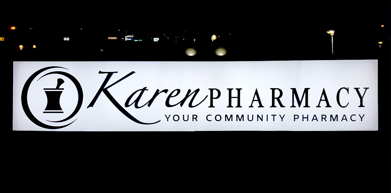
Logo signs and channel letters made of sturdy metal used to be the gold standard for old pharmacy signage design. Business owners installed ribbon style exterior signage on the facade of their building to showcase the brand name.
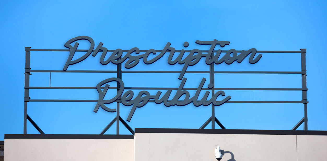
Today, more sophisticated retail pharmacy design styles have replaced standard logos. We can see captivating light up signs on entrances that are great for day as well as nighttime promotions. Straight line pharmacy interior signage is the new trend for displaying brand names.
Colors of Pharmacy Logo Displays
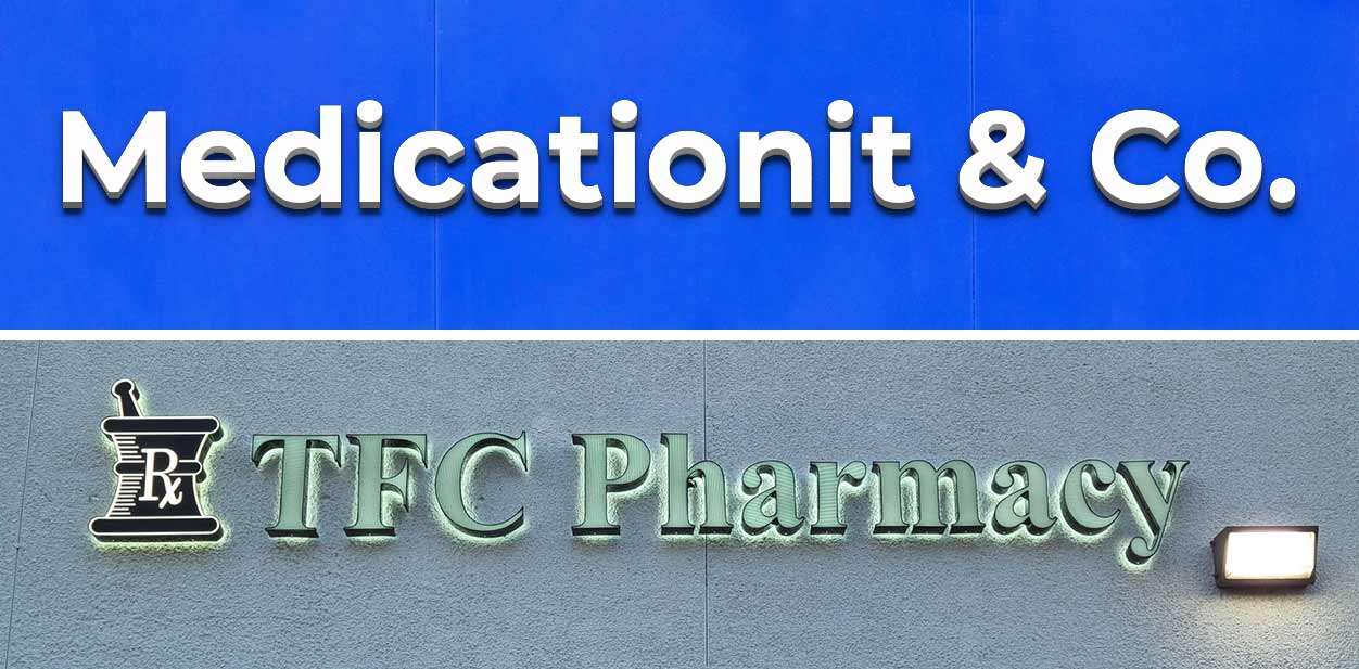
The right colors for branding are also key for successful promotions. Blue and white are still standard colors in the healthcare sector. However, today we’re more likely to see drugstores that choose brighter hues for their logo displays. Colors are the first thing that impact customers. The brighter they are, the stronger their impression will be.
These are the old, new and recurring trends that help pharmacies capture attention and set the right ambiance. Use them in your pharmacy to increase comfort as well as sales.
