Recap of 2020: Best Branding Projects Crafted by Front Signs
The year 2020’s been full of surprises that no one asked for. Despite the challenges, we made a commitment to work even harder and managed to create incredible signage solutions for many brands.
Table of contents
- Best Branding Projects from the First Half of the Year
- 1. January: Signage Project Solution for ACT1 Talent Show
- 2. February: Backlit Storefront Brand Design Project for The Suites Spot
- 3. March: Illuminated Signage Project Solution for the Hyperdeck Event
- 4. April: Corporate Building Dimensional Office Design Project for JP Sportswear
- 5. May: Branding Project for The Liquor Fountain
- 6. June: Signage Project Solutions for Magnolia Park
- Best Branding Projects from the Second Half of the Year
- 7. July: Creative Corporate Identity Design Projects
- 8. August: Branding Image for Southern California Medical Center
- 9. September: Significant Project Branding Examples
- 10. October: Memorable Brand Design Projects Done
- 11. November: Branding Project for Seyhart
- 12. December: Brand Design of The Melrose Vet
As December winds down, it’s time to take stock of what we’ve done and share our experience. This article contains a full recap of the best business signage projects implemented by Front Signs sign company in 2020.
Best Branding Projects from the First Half of the Year
There was no lack of signage design for us to get busy with during the first half of the year. From trade show displays to store and event branding, read on to learn about the best projects we achieved from January to June of 2020.
1. January: Signage Project Solution for ACT1 Talent Show
The ACT1 Talent sign was the highlight of the show with its striking look achieved by our designers. The bold logo captivated the crowd and provided a prominent background for dancers to showcase their talent.
The name of the show is displayed on a special metallic construction fixed on the stage. Front Signs used attractive LED lights to provide energy-efficient illumination for the dimensional letter signage.
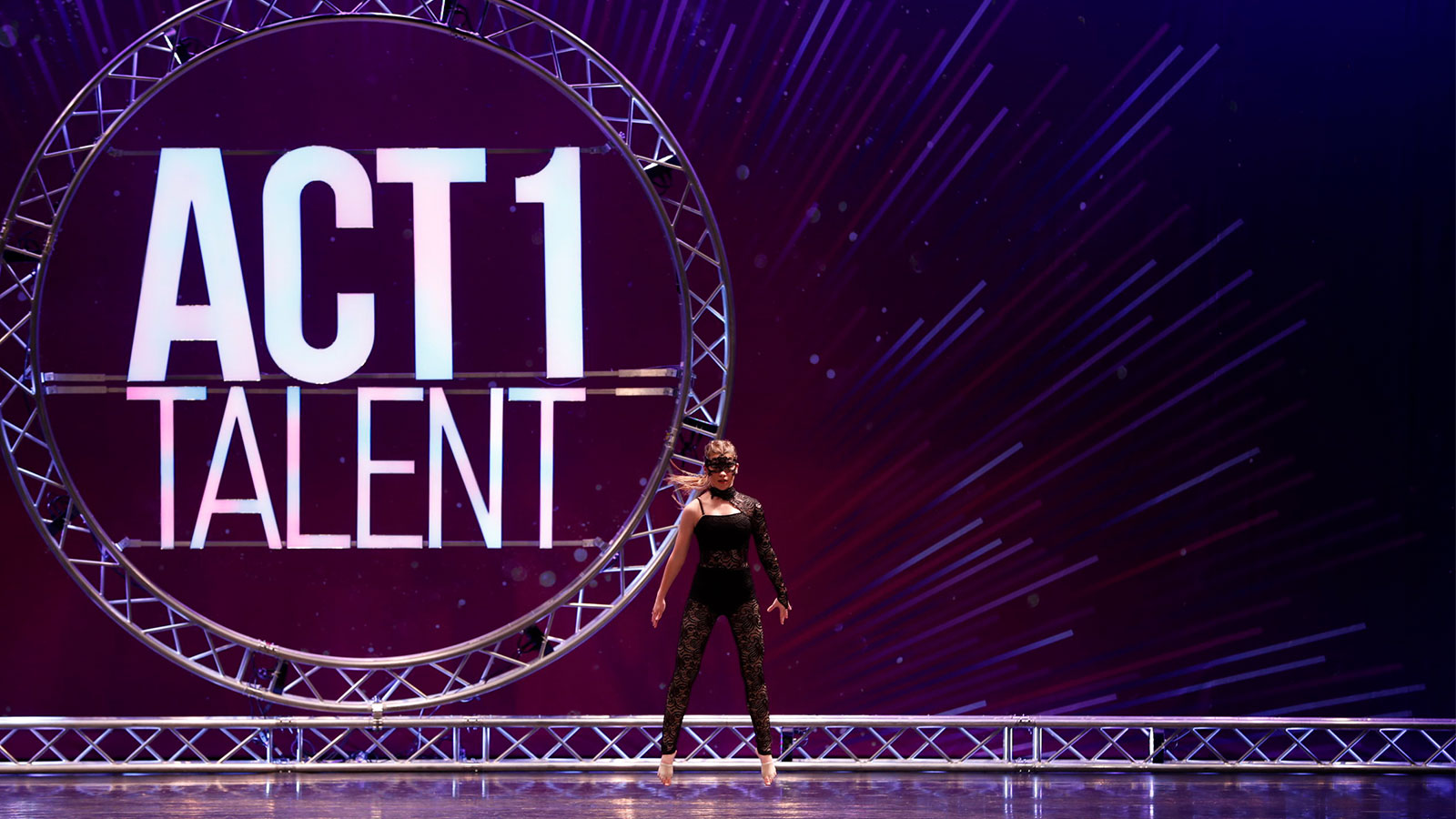
The logo consists of big, bright light up signs. To bring memorable visuals to life, we used durable materials such as aluminum and acrylic.
2. February: Backlit Storefront Brand Design Project for The Suites Spot
This is one of the best brand identity designs we had the pleasure of working on for the storefront signage of The Suites Spot. The company’s name and logo are exhibited with an eye-catching letter sign. The LED illumination provides a brilliant glow to the building.
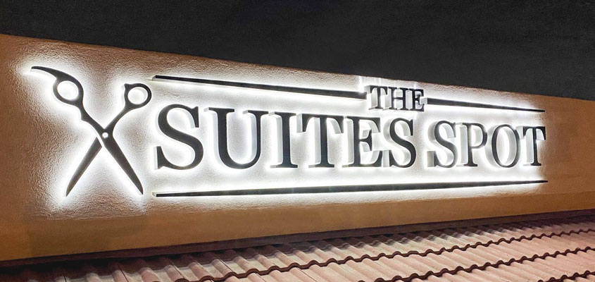
The reverse channel letters are mounted with special pins that grant a clean and distinct look to the design. We used premium aluminum and acrylic for this brand design project.
3. March: Illuminated Signage Project Solution for the Hyperdeck Event
It was a pleasure to do a brand design project for Hyperdeck. The project included illuminated letters that stylishly presented the name of the company during the event. This corporate event signage enhanced Hyperdeck branding and made it shine with energy-efficient LED lights.
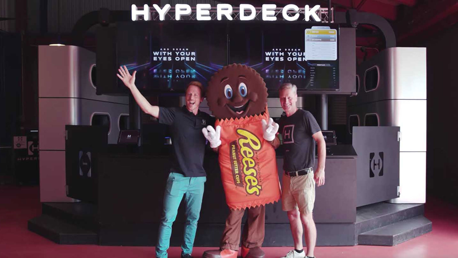
The design elements were fixed onto a tailor-made acrylic base. The sign itself consists of durable aluminum and acrylic materials.
4. April: Corporate Building Dimensional Office Design Project for JP Sportswear
In April we put in our best efforts to adorn the business site exterior for JP Sportswear. To increase their brand visibility, we displayed the name and logo of the company on both sides of the building.
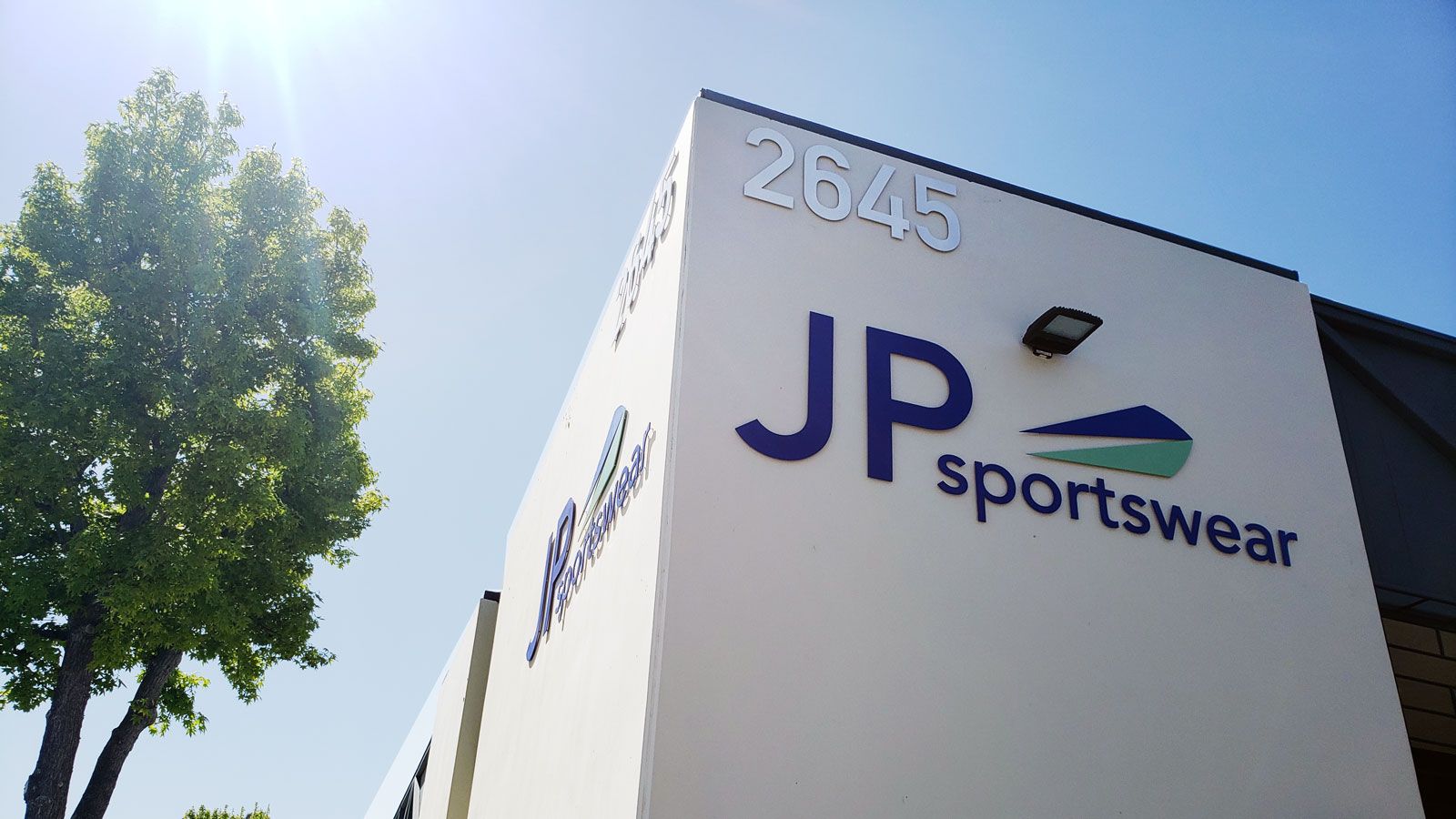
The 3D letter signs are painted with premium UV-resistant inks to withstand all kinds of weather conditions. We used heavy-duty aluminum for the construction of these exterior building signs so they will last for a very long time.
5. May: Branding Project for The Liquor Fountain
Front Signs got creative with the branding for The Liquor Fountain. This project branding example represents eye-popping solutions to bring the shop into the current era while preserving it’s vintage vibe.
We were responsible for a high-end finish for this office design project. It consists of lighted marquee and pylon signs displaying the company name and logo. The light bulbs around the marquee’s borders grant an unmistakably retro look.
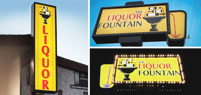
These light box signs complete the best brand identity design to create a classic feel for the entire space. The signs are made of durable aluminum and acrylic so you’ll be seeing them around for a long while.
6. June: Signage Project Solutions for Magnolia Park
Magnolia Park Arcade Building is one of our coolest project branding examples. We did a complete brand redesign for the shopping center with multiple signs such as monument signs, hanging nameplates and directory boards.
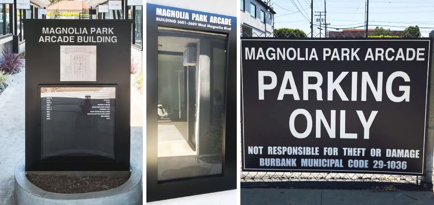
A broader spectrum of hanging signs with the names of tenants were displayed throughout the building. They grant visual appeal and express the brand’s style in a sleek black and white aesthetic.
The outdoor signs for Magnolia Park are made of high-quality styrene and aluminum materials to last for an extended period of time. One of the directory signs is attached to the monument building while the other is free standing at the center of the establishment.
Best Branding Projects from the Second Half of the Year
Let’s continue with our list of best branding projects encompassing the second half of 2020.
7. July: Creative Corporate Identity Design Projects
Trademark Solutions for Ways Home Care
Our professionals crafted company signs for Ways Home Care & Health Agency. This is an excellent project branding example featuring illuminated signs and big versatile channel letters.
The company name and logo were displayed with classy letters and a tasteful light box.
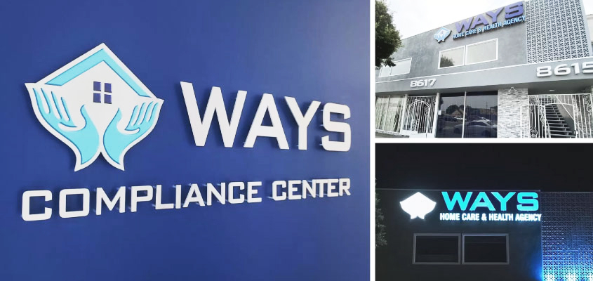
Backlit numbers are also a part of this brand design project to highlight the company’s address. All of them are lit by efficient LEDs and showcase supreme material craft and quality using acrylic and aluminum.
Branding Example for Beauty Counter
The next impressive office signage project on our list is for Beauty Counter, a skincare and cosmetic products company. We did storefront branding with high-quality window adhesives and a stand sign for the promotion of the brand.
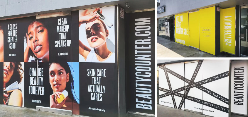
The creative corporate identity design includes custom decals that are made of top-quality opaque vinyl. Top large format printing technologies and materials were used to reach the superior quality. The stand is made of premium acrylic and PVC materials. The key project branding strategy was integrating bright colors with the logo of the company to match it’s lively image as well as capture everyone’s attention.
Creative Corporate Identity Designs for WestWorld Productions
This is one of our favorite signage project solutions to date. Our tailor-made 3D letters transformed the whole scene at WestWorld Productions in Beverly Hills.
We displayed the name of the company on the facade of the building with brilliant reflective letters. Their exquisite style and refined design elements glow up the whole neighborhood.
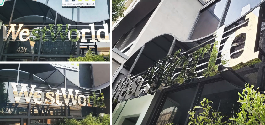
Its best brand identity design lies in the golden brilliance of the material selected. It creates prominence and leaves a captivating impression. The state-of-the-art sign is fixed on a special hanging construction and made of premium mirror acrylic and aluminum.
8. August: Branding Image for Southern California Medical Center
Our experts delivered a first-rate makeover for the Southern California Medical Center with a complete brand design project. A new welcome sign adorns the entrance and informative signs can be seen throughout the site.
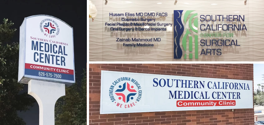
Their logo is displayed on the main building with a light box and versatile lettering. Other light boxes designate names and enhance illumination on different buildings of the center.
Two free-standing pylons complete the design project with the name and contact details of the medical center. The fully customized branding effort for the center creates a comprehensive look and establishes a professional brand image.
9. September: Significant Project Branding Examples
Orion Optical Vision and Style
The project for Orion Optical represents storefront branding with a creative touch. The signs displayed on the facade of the plaza building look stunning all day long. They introduce the company’s name and logo with distinct elements.
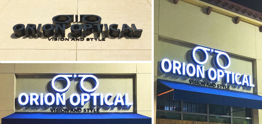
We didn’t ignore the back of the building either. The LED illuminated letters adorning it speak volumes. They’re made of highly durable acrylic and aluminum materials.
Brand Solutions for Renu Med
Another engaging project branding example by Front Signs was for Renu Med. We made multiple signs for outdoor branding with trendy black letters on a raceway. Displaying the name and logo of the company, Renu Med signs depict a creative artistic twist and an exquisite style.
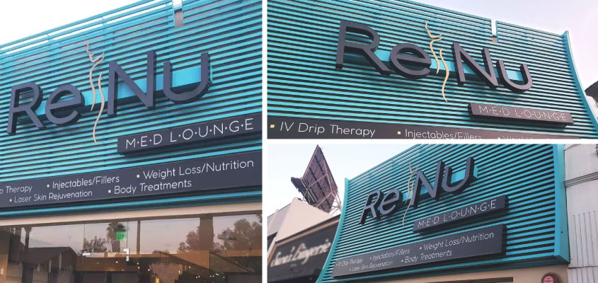
Black letters against a blue-tone background add a luxurious vibe while a golden female profile in the middle separates the two words in subtle yet dramatic fashion. The light box is made of top-quality aluminum and acrylic and mounted to the wall by a raceway. It emphasizes the brand identity, drawing attention from every angle.
10. October: Memorable Brand Design Projects Done
Lamborghini Huracán EVO RWD
What happens if we channel the power of 610 horses behind the wheel of a glorious Italian car? Pure exhilaration. The presentation of the Lamborghini Huracán at Willow Springs International Raceway was an honor for our team.
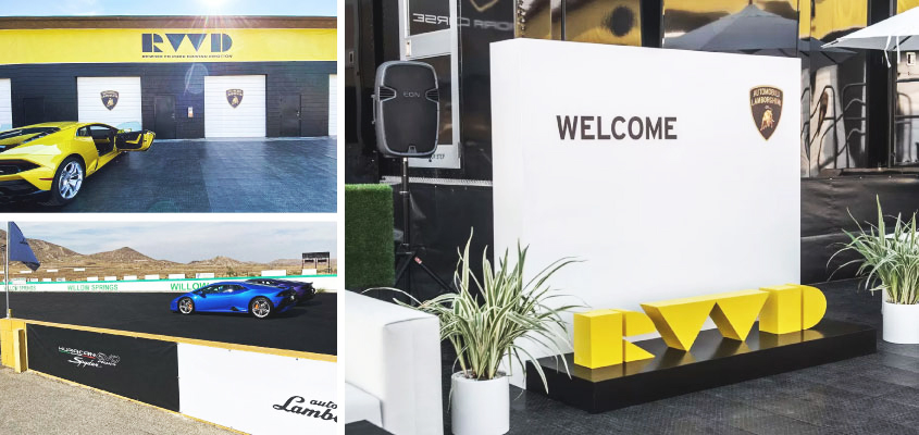
Our creative signage project solutions fully expressed the hurricane style and performance of the race car. The aluminum wall with sporty wooden letter signs was a welcoming accent for visitors.
The creative corporate identity design for Lamborghini consisted of two shapely fabric banner displays. Multiple Lamborghini logo signs were set in different locations. We also provided stadium signage solutions for the raceway with vinyl banners that lived up to the best brand identity design in the game.
Brand Design Project for Modern Animal
The two-fold branding design project for Modern Animal includes indoor as well as outdoor elements. All the signs for the project are elegant and represent the brand’s polished style.
The project introduces prominent letters on the storefront, sleek black letter lobby signs inside the premise as well as parking and wayfinding signs throughout. Lastly, window stickers with the brand name play an important role in the project’s cohesiveness.
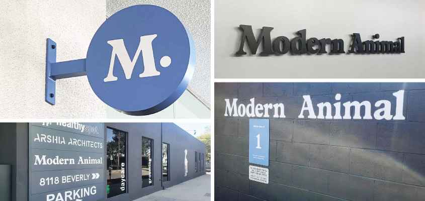
These outstanding design solutions will serve the company for a long time. They’re primarily made of durable aluminum, acrylic, dibond and opaque vinyl.
11. November: Branding Project for Seyhart
Our project for Seyhart wellness center in Santa Monica was up there with one of the best brand identity designs by Front Signs. Our specialists labored to get complementary signs for both their indoor and outdoor branding needs.
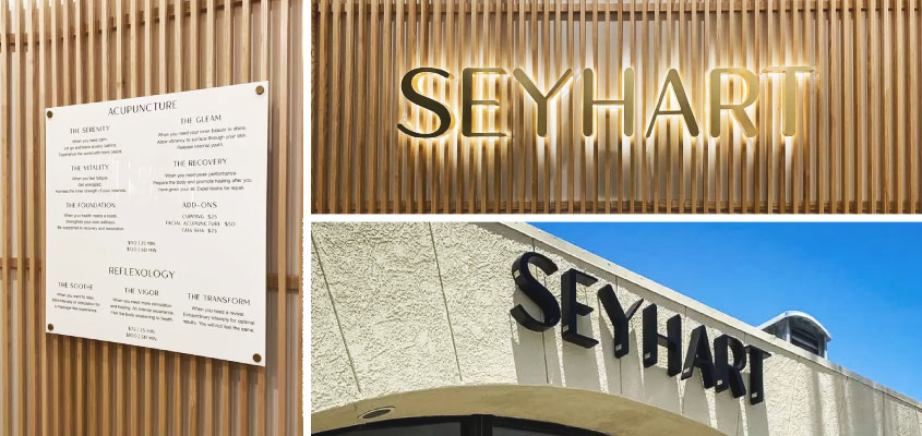
Displaying the name of the company with beautiful backlit letters assured that Seyhart wouldn’t complain of a lack of attention anytime soon. These letters provide non-stop visibility and enhance the brand’s aesthetic from all angles.
The project branding strategy for Seyhart includes solutions for both outdoor and interior signs. The elegant letter signs are made of quality aluminum and acrylic and the backlit signs are LED illuminated.
12. December: Brand Design of The Melrose Vet
Pets are people, too. This is the iconic company motto of The Melrose Vet, one of the best branding project concepts we’ve worked on (in part thanks to their sweet motto). Based on stylish black and white wall letters, the sign for The Melrose Vet speaks to their cultured and compassionate nature.
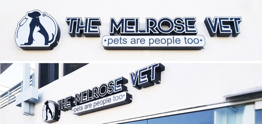
Attached to blank white walls, these custom signs call in all the pet-loving visitors. The fine look and quality of the signage is guaranteed with the high-end materials used in its fabrication.
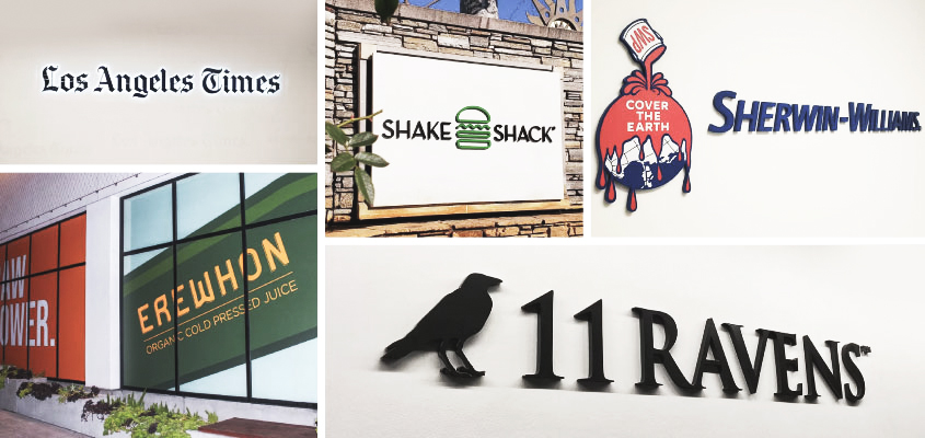
These are only a few of our favorites but the real list is long as we’ve been busy designing and crafting all year round. You can check out our signage projects for Beatclub, Erewhon, Sherwin-Williams, Shake Shack and beyond in our portfolio.
Whether you’ll be spending the holidays with your family or friends, we wish you health, wealth and happiness in the upcoming year. We’re excited to see you with new projects in 2021.
