The Refinement of Retail Store Design Trends Over the Decades
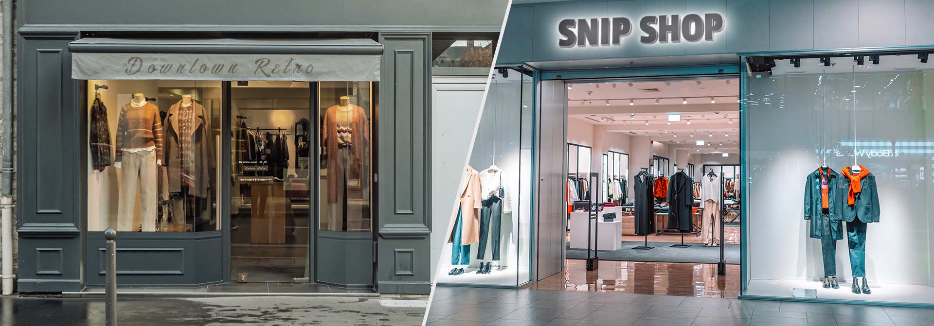
Retail stores are more than places that sell merchandise. They’re hubs that set fashion trends. Creative layouts have made them stand out and attract shoppers for centuries. Like every business, retail store designs have undergone changes during the last century. Entrepreneurs continue to adopt modern design solutions for their stores. Today, they use marketing techniques that didn’t even exist before.
Table of contents
As an experienced sign making company, we’ve compiled a list of retail store design projects that set the trend for contemporary marketing. Check them out and create a modern retail store design with our custom business signs.
Retail Store Exterior Design
Exterior features are the first things that attract shoppers. Retail storefront design prepares customers for the collections they’ll find inside.
1. Glass Doors
We can’t discuss retail store exterior design without first mentioning Herculite doors. These huge entrance doors made of glass haven’t lost their popularity over time. They’re the best surface space for showing off your retail store interior design.
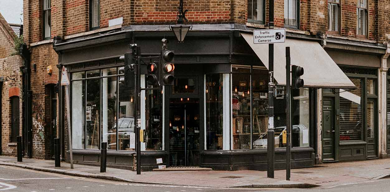
Glass doors and windows set up the allure for passersby. They allow sunlight to flood into the building and fill it with natural light during the daytime. Meanwhile, they captivate window shoppers at first glance and pull them in.
2. Promotional Items
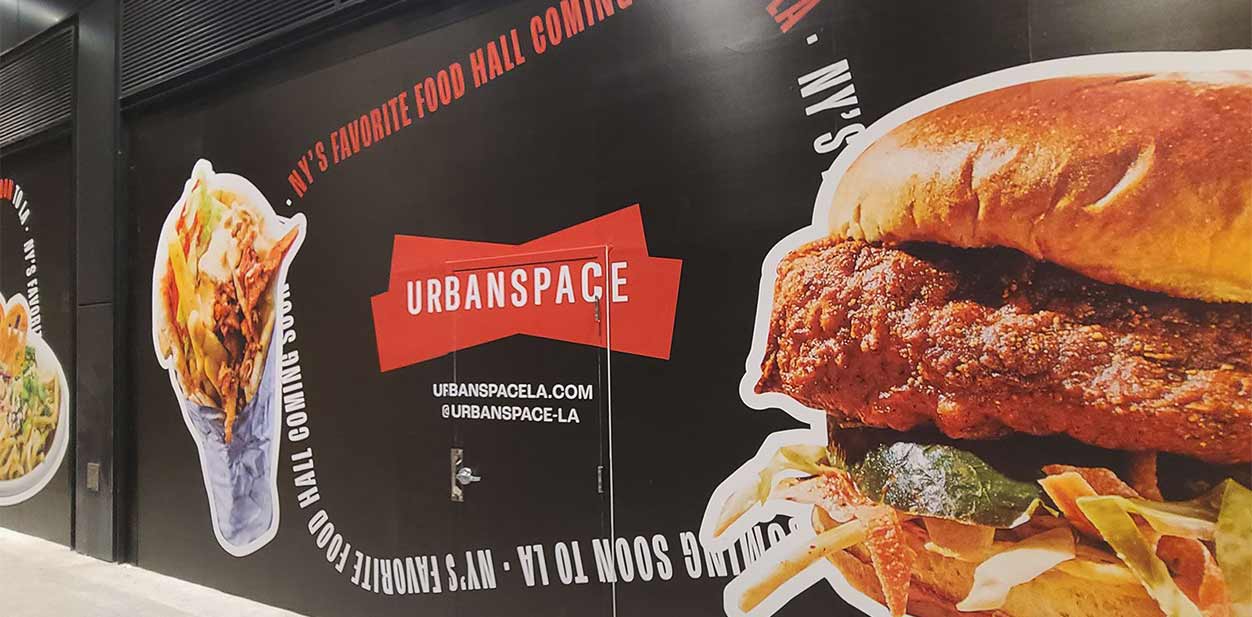
Paper posters were the golden standard for retail store ads in the 20th century. Business owners glued posters to nearby walls. This is how they announced the latest news and sales.
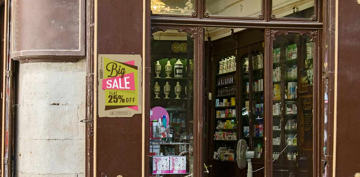
Today, we see more innovative promotions with marketing items such as custom decals. They’re usually made of vinyl and come in all shapes and sizes. Modern materials and graphics are vibrant and resilient. Replacing retro paper posters comes as a no-brainer. They accompany light up signs for round-the-clock promotions. This type of retail store exterior design can advertise your location even from a distance.
3. Products on Display
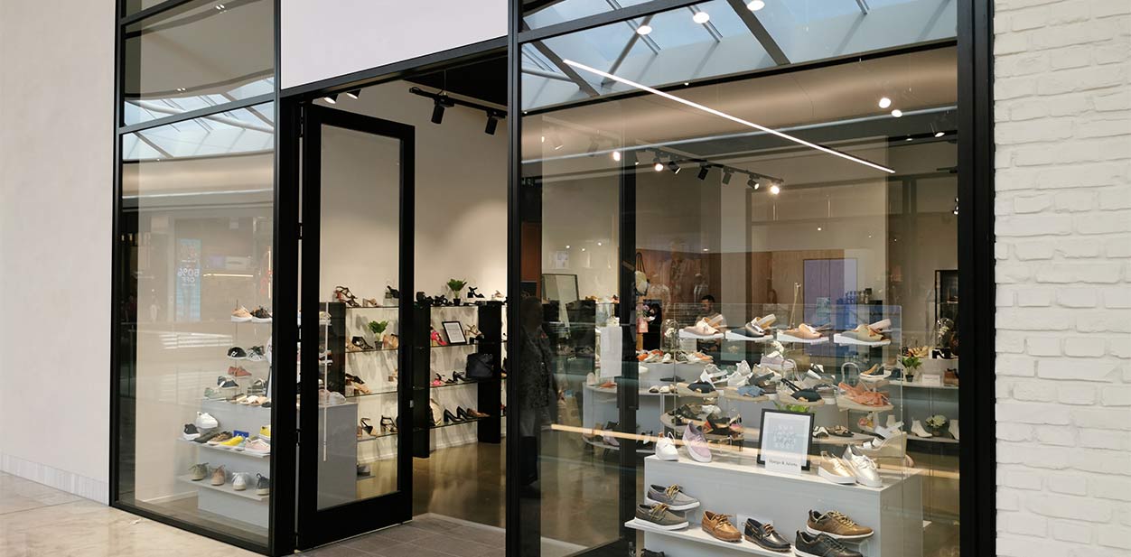
The best way to advertise a product is to place it behind a glass display. It’s a popular concept among retail storefront design trends that’s still effective. New collections and best sellers are showcased behind glass due to its functional and elegant nature.
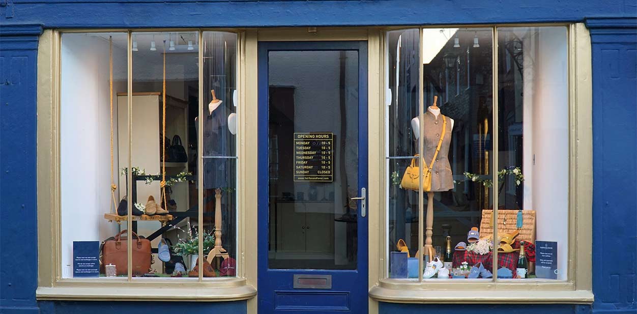
Many boutiques advertise products behind large free-standing display cases embellished by colorful window decals.
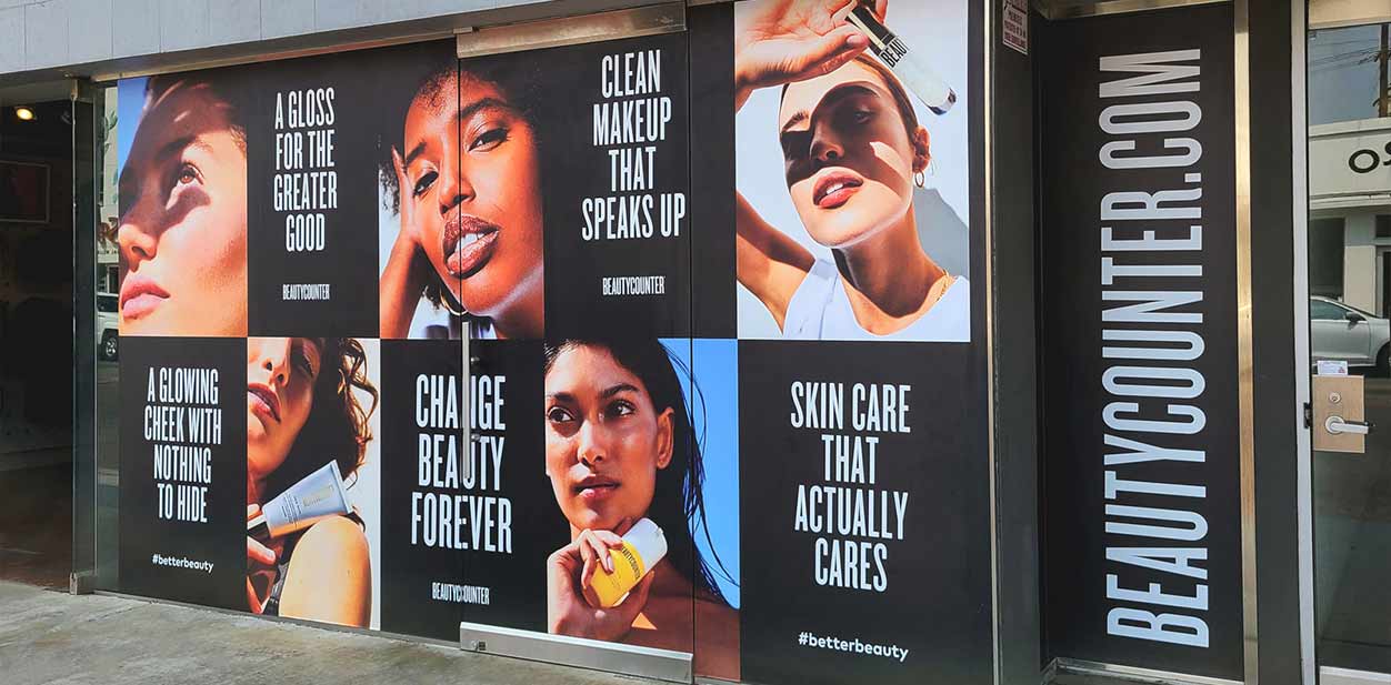
Meanwhile, digitally imagined online product displays are gaining popularity in virtual retail shop design. A main product is accompanied by items that supplement it in order to boost sales.
Retail Store Interior Design
Once your customers are inside the store, your retail interior design should guide them through the space.
1. Accentuated Walls
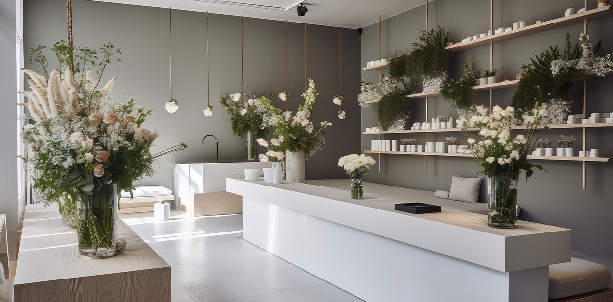
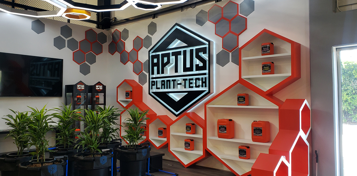
Pique customer curiosity with your retail interior design. Make sure it creates a comforting atmosphere for shopping. Accent walls can make up a major portion of your retail store interior design. In the past, owners would highlight indoor spaces with these walls. Wallpapers with delightful floral ornaments and pastel colors were in vogue.
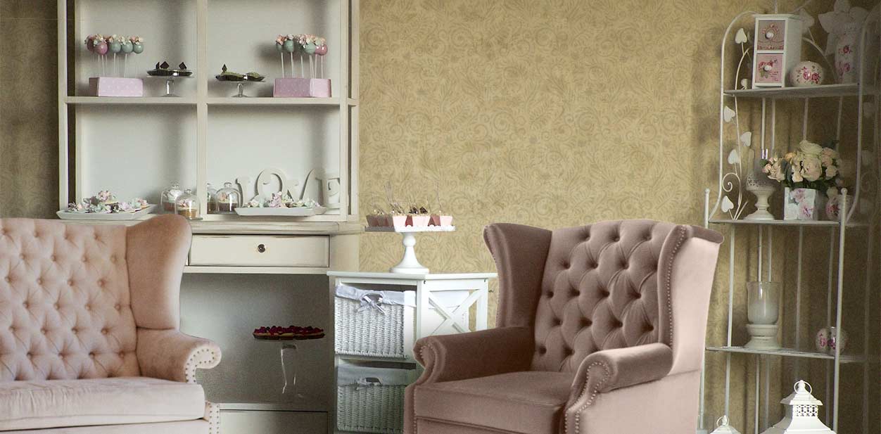
Today, retail interior design attracts shoppers with wall decals and other graphic adhesives. They allow stores to accentuate all flat surfaces including floors and ceilings. These and other modern signs can set whatever mood you want, be it chill with earthy hues or lively with brighter notes.
2. Interior Lighting
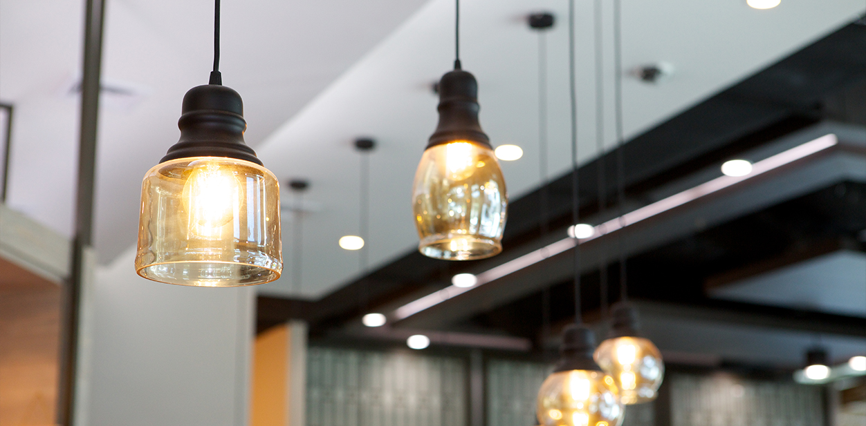
Lights play a crucial role in retail store designs. Store lighting has a direct impact on the purchasing behavior of shoppers as well as the productivity of employees. Decades ago, store owners would install fluorescent flush spotlights to illuminate their brand name and products.
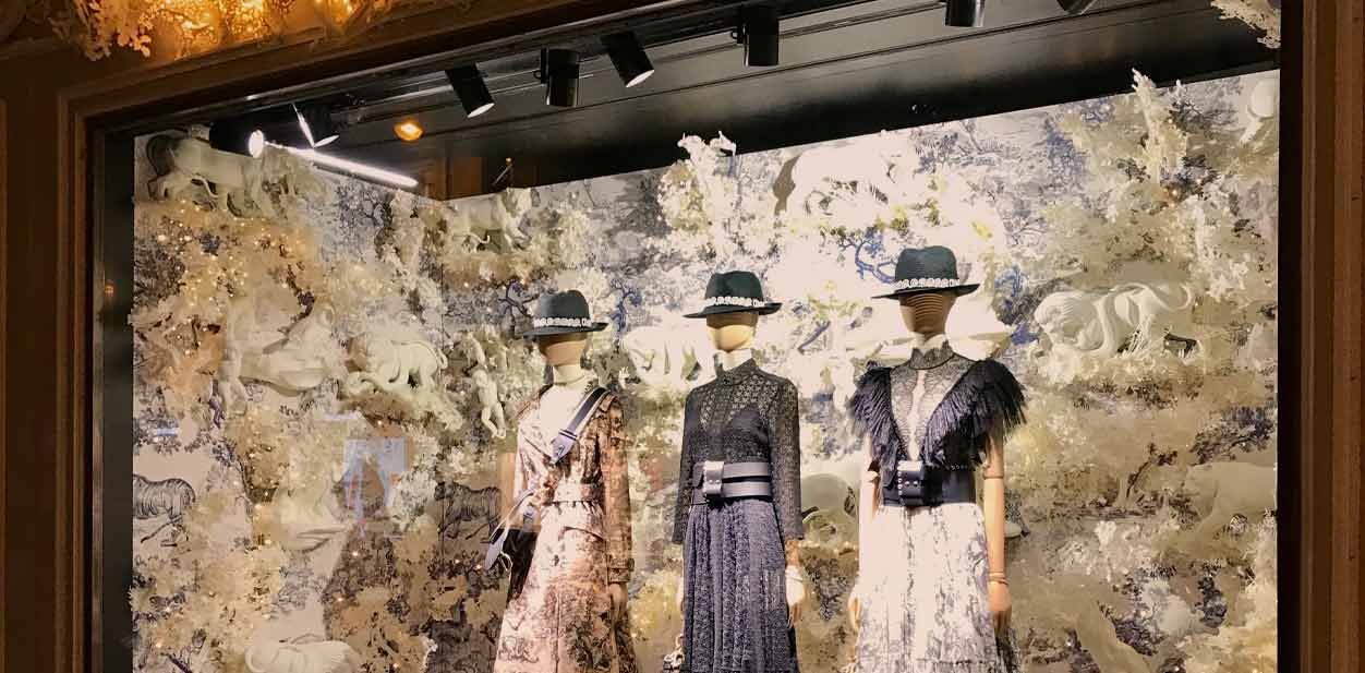
Today, retail interior design integrates spotlights to show off products on display. Fluorescent lighting is best for presenting the true tones of an item. Meanwhile, modern custom letter signs and store signs with illumination substitute older styles of displays.
3. Narrow vs. Wide Pathways
Old retail store designs often had small interior spaces. In the past, shopping aisles were set close to each other, leaving a narrow pathway for customers. As a result, stores were crowded and uncomfortable to navigate.
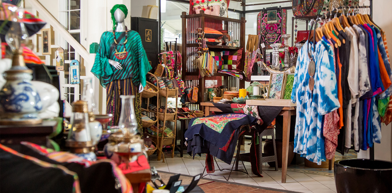
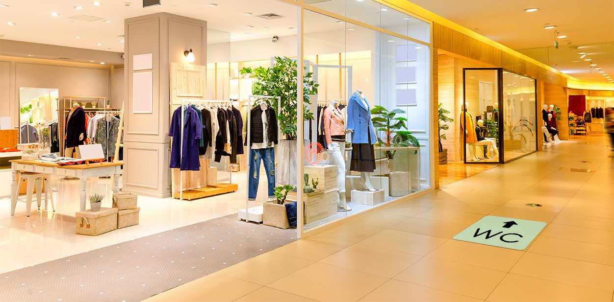
This type of layout is a thing of the past. Modern retail store design allows shoppers to freely navigate inside their stores. The aisles are set far from each other to create spacious pathways. Accordingly, store floors can be used for wayfinding and promotional floor decals.
Retail Store Signage Design Upgrades
Retail store signage design has also undergone dramatic changes. These brand name displays differ from each other by material, style, lighting and other features.
1. Retail Storefront Displays for Facades
Brand name and logo displays are the first that customers notice before they walk through the doors. The more creative these and storefront window designs are, the more people they attract.
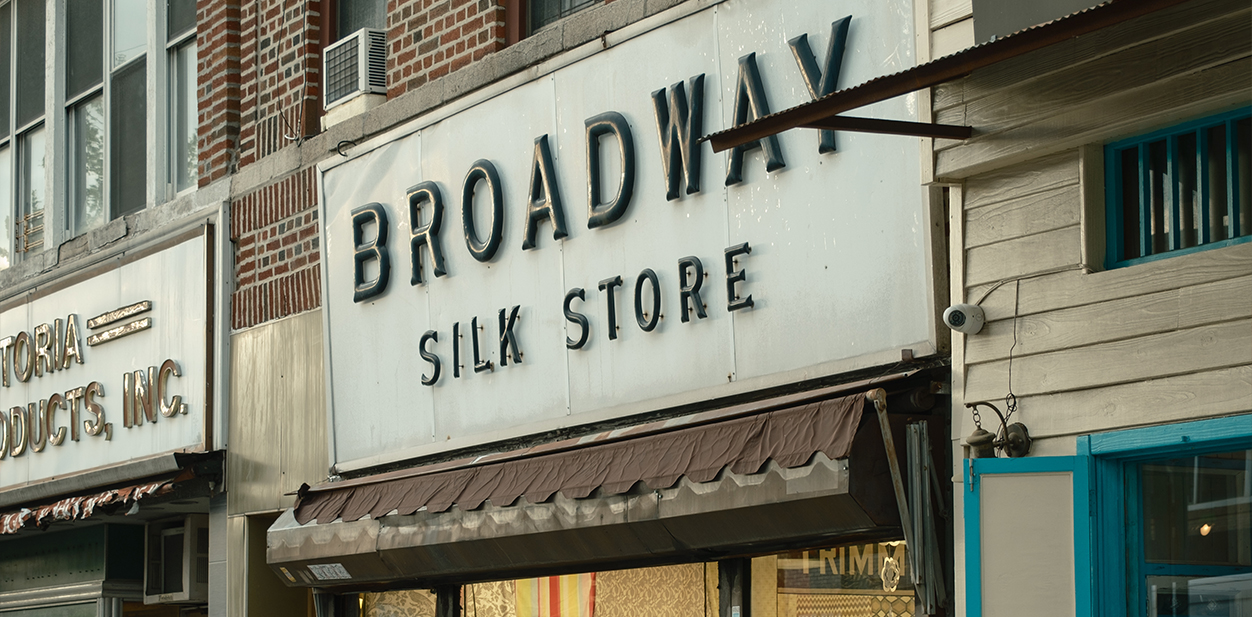
In the past, free-style font channel letters made of steel were installed right above the entrance doors. The ceiling was often an extension of the facade to act as a support mechanism for the heavy displays.
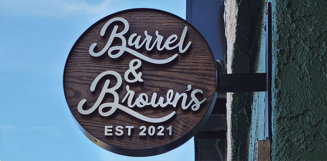
What we see today is much more advanced. Luxury retail store design solutions let businesses showcase majestic exterior signage like blade sign projects. They’re made with sophisticated designs and mounting mechanisms. Lightweight materials and complex cutting techniques allow for greater creativity.
2. Retail In-Store Signage Solutions
Standard posters and displays were the most widely used advertising medium in the past. People would hang them to present announcements, sales or informative messages.
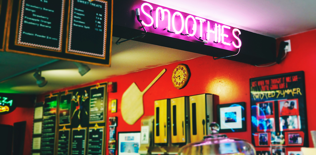
Nowadays, retail store signage design showcases displays with everything from digital screens to augmented projections. They stand out with digitization, sleek designs, intricate engravings and beyond. These concepts incorporate interior signs for promotional, informative and decorative purposes.
Feel free to integrate any of these retail store designs in your department store. Be it ultra-modern or blast-from-the-past, they’ll be sure to increase your sales.
