SME Businesses Respond to What Logo Fonts They’ve Chosen and Why
The article is based on a survey conducted by Front Signs. Out of more than 100 respondents, we’ve filtered the most relevant answers and presented them below with examples of their logo signs.
Table of contents
-
- 1. Bold Sans Serif – Daivat Dholakia, Director of Operations at Force by Mojio
- 2. Mercenary Black and Miller Type Foundry – Milosz Krasinski, Managing Director at Chilli Fruit Web Consulting
- 3. Charoe – Leslie Danford, Founder of Vitaminis LLC
- 4. Warehouse – JohnFrigo, eCommerce Manager of BestPriceNutrition
- 5. Work Sans – Debbie Liu, Owner of Peachy Home Buyers
- 6. Orator – Steve Seidel, CEO & Founder of The Seidel Agency
- 7. Montserrat – Steven Picanza, Co-Founder of Latin & Code
We hope the content will inspire the design of your own business signs and logo signs.
1. Bold Sans Serif – Daivat Dholakia, Director of Operations at Force by Mojio
We used a custom font for our logo. It’s a bold sans serif font. We specifically wanted a font that was eye-catching, dynamic, and minimalist without being boring. Since we only use a single text-based logo, we wanted it to fully convey the message of our business on its own. There’s no other picture or shape to rely on – just the impact of the text itself. This is also why we had a custom font made rather than use a pre-existing one. With so many businesses using Helvetica, Arial, and other predesigned fonts, we wanted to take the opportunity to stand out. We were quite happy with the result. Our logo forms the center of our branding and brand identity, and we use similar fonts on our website and in marketing material.
A great option to display your logo 24/7 is with channel letter signs.
2. Mercenary Black and Miller Type Foundry – Milosz Krasinski, Managing Director at Chilli Fruit Web Consulting
When it comes to a business logo, my advice to my clients is always to keep it clean and clear – your font can be as jazzy as you like but if nobody can actually read what the text says then it’s all for nothing. For my own business logo, I used two different fonts: Mercenary Black and Miller Type Foundry. This works really well as the two fonts compliment one another and combine to create a logo which is attractive but not fussy.
3. Charoe – Leslie Danford, Founder of Vitaminis LLC
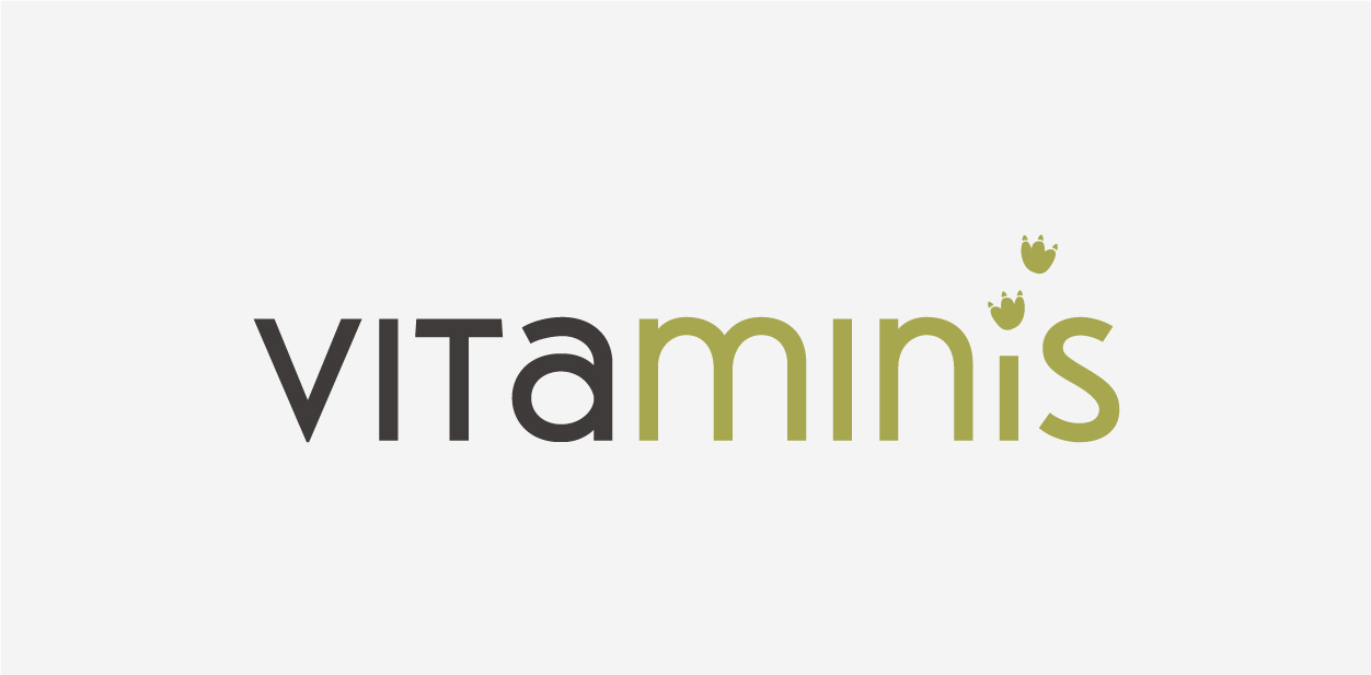
I chose Charoe font for my logo. Vitaminis is a nutritious, portable drink shot for kids so we wanted the font to be playful and fun. The rounded letter shape and mix of capital and lower-case letters achieves this. Further, we wanted a modern looking font that would appeal to the choosy parents who would be purchasing this drink. The Charoe font achieves this, whether in a stylized logo format such as the attached or simply in typewritten form.
Check out store signs, another visual tool where you can get playful and creative.
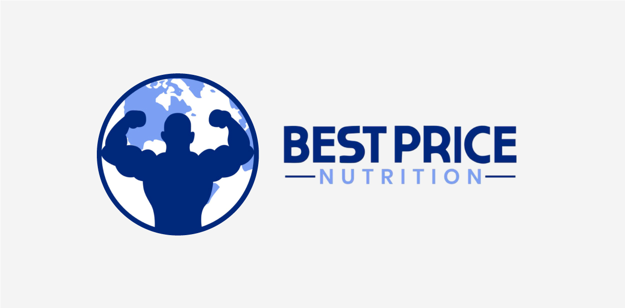
4. Warehouse – JohnFrigo, eCommerce Manager of BestPriceNutrition
We recently redesigned this logo. It’s simple, a single color, looks good online and offline and, to me, is the most brandable. I think the font of this one also most reflects the brand as it’s very much a warehouse font.
5. Work Sans – Debbie Liu, Owner of Peachy Home Buyers
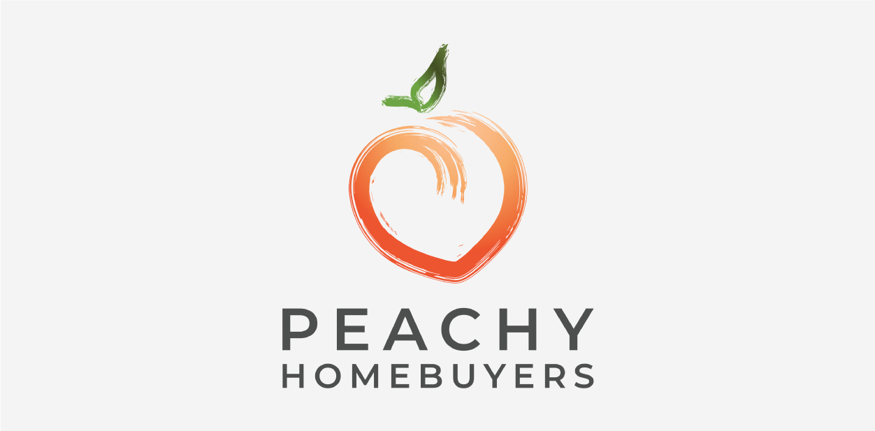
For our logo, we wanted the font itself to also represent who we are as a company. It’s a staple, dependable, bold – it is Work Sans. After several font combinations and revisions, we felt that Work Sans best fit our visions for the composition of the logo. We love how the font compliments the peachy logo itself. It is clean and sleek as compared to the logo which has abstract touches and color combinations. We felt that combining the two brings contrast and play to the eye.
Read our article to get more insights into winning corporate branding strategies.
6. Orator – Steve Seidel, CEO & Founder of The Seidel Agency
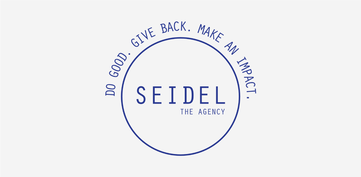
Steve Seidel, the CEO & Founder of the Seidel Agency has shared the logo choice for his company and also what they wanted the font to reflect:
“Our font is Orator as our goal was to deliver sophistication with an emphasis on design and technology. Our font is meant to represent a traditional, yet nostalgic and clean feel as we work with many physicians and precision is key.”
7. Montserrat – Steven Picanza, Co-Founder of Latin & Code
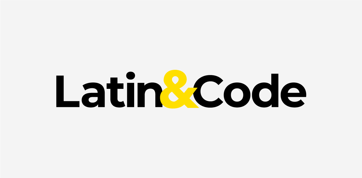
Steven Picanza, the Co-founder and Global Brand Strategist at the Latin and Code strategic branding and marketing consultancy, shared their logo font choice and why it was the most effective one for them:
“We are using the Montserrat font for it’s ease of viewing in print, web, and mobile.”
Let’s Sum It All Up
It’s clear that the businesses surveyed all have a logo font that’s unique to their identity. Still, they all share common goals when it comes to their overall design. They all want to achieve a logo that is:
- Eye-catching and identifiable
- Has a clean and minimalistic look
- Reflects the brand’s values and identity
We hope this short survey has been helpful to you. Let us know if you have any questions and would like guidance on deciding the logo design for your brand. We offer free signage consultations and our team is ready to provide end-to-end sign making services, starting from 3D design and finishing up with installation.
