Welcome to our newly launched re-branded website!!!
Lily Travis
Here at Front Signs we all are thrilled to announce the launch of our NEW, RE-BRANDED website.
Table of contents
After hard and sometimes even overtime work the marketing team at Front Signs, comprised of designers, UX specialists, content writers and marketers created a more sophisticated website browsing experience for its users.
Now, what is rebranding?
Rebranding is the process of changing the corporate image of an organization.
What we changed?
It will be easier to say what we didn’t.
Here is the list of the changes that now provide a better purchasing experience for our customers:
- Logo
- Website interface
- Product pages
- Sliders for Promotions
- And the most important: Orientation – business
Why we rebranded?
Having our customers’ feedbacks, reviews, and behavioral data, taking into consideration every single detail, we came to a decision to renovate everything for better business signs purchasing experience for our customers.
We changed our interface but stayed true to our main principle: to have A SATISFIED CUSTOMER.
LOGO
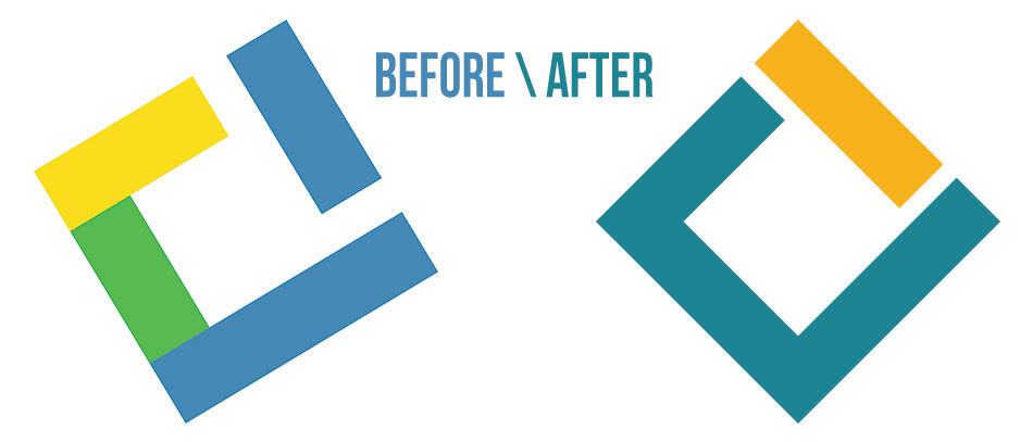
If you remember or even if you don’t, our previous logo was tricolor: Green, Yellow and Blue.
After rebranding we left the green out finding the combination of blue and yellow closer to our company vision.
The blue color symbolizes trustworthiness and maturity. We are sure that we are trustworthy taking as basis our customers’ reviews, feedbacks and every day growing number of orders. Yet, along with this serious image we decided to combine the color Yellow that symbolizes both friendliness and mental stimulation. Being a business oriented company we still want you to feel comfortable in our website.
Let’s pass to the changes.
First of all we changed the whole interface of the website.
To a comparatively monotone website came to replace a new, livelier and more interactive one. Now you can find everything more easily.
Now it is more eye catching and user friendly. The new website is livelier, the promotions are represented through sliders that make the user notice them.
Product page
Formerly the description of the product was a 1000 word text, which contained all the important features of the product. ⬇
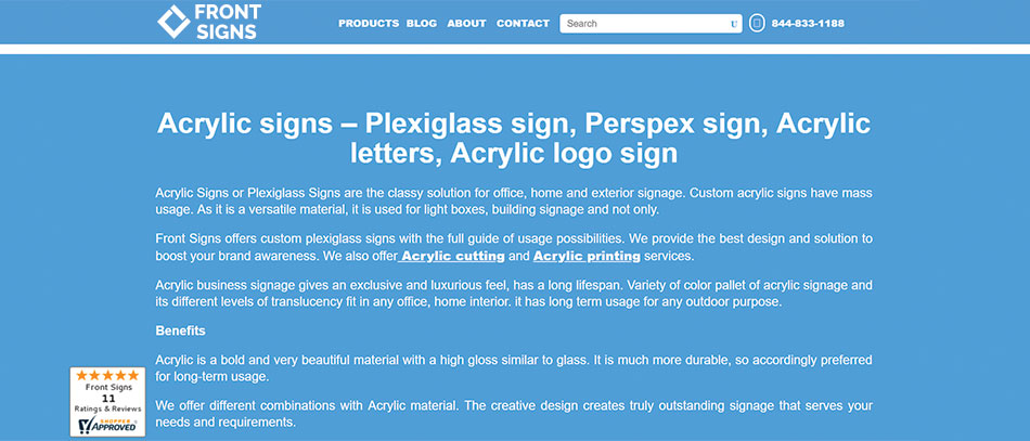
Yet we found the necessity to take it to pieces for providing more digestible information on products for our users.
Just look at how great the product description and the whole interface have changed.
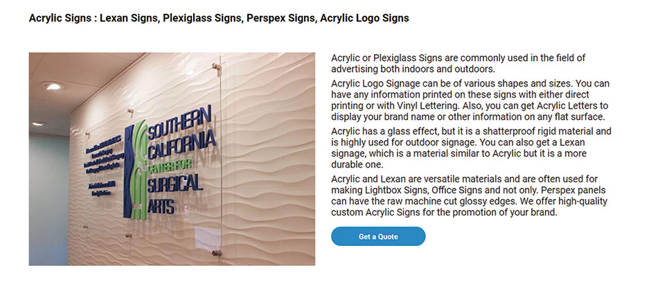
Feel the difference?
Here are the categories we separated for a better user experience on each product page:
- General Description
All the information you need to get a general idea about a particular product is represented here.
Let’s take Acrylic Signs:
In the description section in two words you get to know that you can print on acrylic, apply vinyl lettering, use it for making building signs, light box signs, 3D letter signs, office signs, interior signs, lobby signs, etc.
- Types
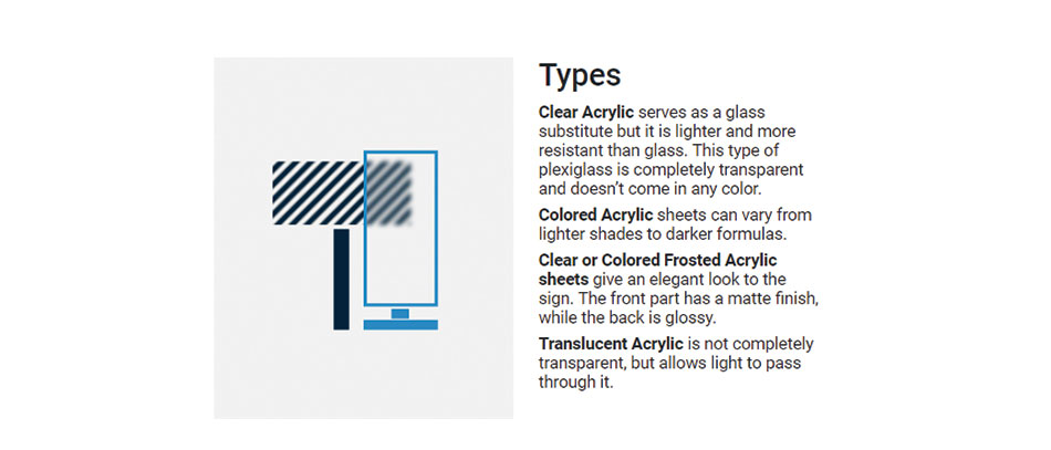
If a product comes in different variations, you can find its types in this section. It makes your choice easier and gives more options for the right choice.
For a better image just have a look: Acrylic types are clear, colored, clear or colored frosted and translucent.
- Usage
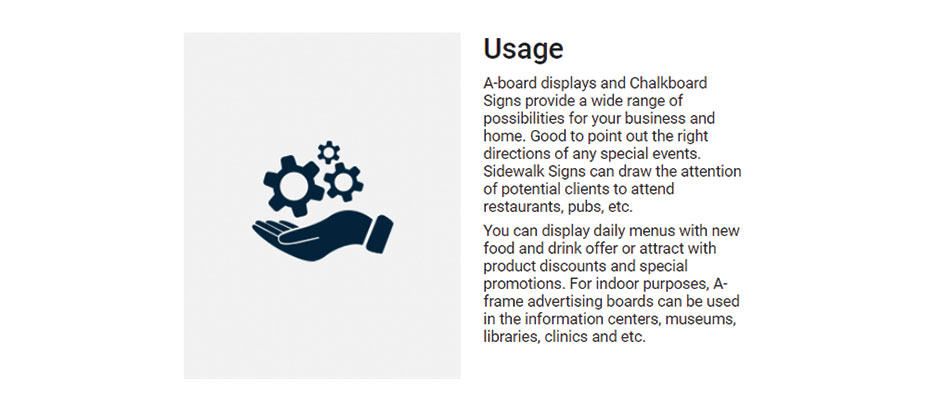
For a better vision of the product, we show you the main industries and areas of usages for a particular product.
Look A-frame signs. The usage sections tell that A frames can be used as event signs to point out the right directions, draw the attention of potential clients to attend your restaurant, pub, offer promotions, announce sales, etc.
- Installation
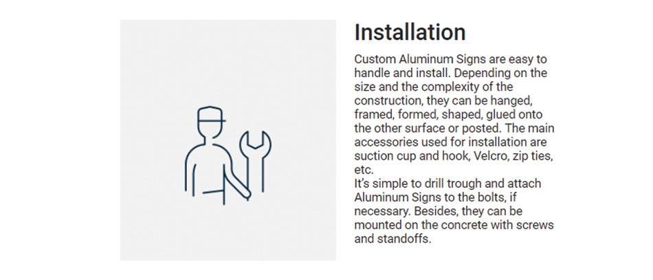
The sign installation techniques differ from sign to sign. So in each product page we have the installation techniques described for each of them. A good example is aluminum signs installation – hanged, framed, formed, shaped, glued onto the other surface or posted.
- Specification
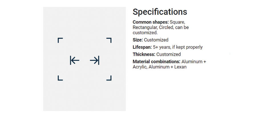
On the same principle are represented the specifications. Taking into account the features of each product we showed them in this section in the following look:
In the picture you see specifications of light boxes.
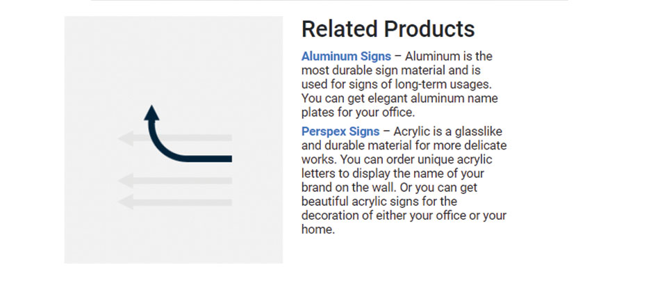
- Related products
Don’t find PVC a suitable material for your future sign?
In the “Related Products” you can find other materials that can be suitable for the kind of sign you’re looking for:
PORTFOLIO
Here it comes – the PORTFOLIO.
The portfolio section includes all the works we have done since the first day of our foundation. Photos of large format printing, ready-made vinyl banners, custom decals, store signs already installed, wall graphics, pylon signs, stadium signage and what not.
Portfolio will help you get a full image of our manufactory, sign making methods and final product looks.
BUT…
If the photos are not enough for you, you are very welcome to visit our in-house manufactory to see everything with your eyes.
And guess what our portfolio photos have. Well, besides the description that tells everything about the depicted product, you will also find the category to which the photo belongs.
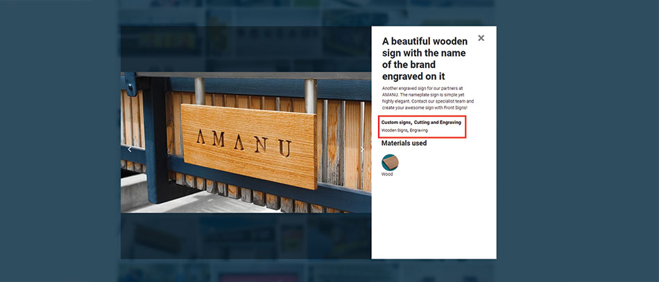
For a better understanding let’s analyze a photo.
At first you see the general description of the photo with bold letters. Under it comes more detailed information.
Right after it comes the best feature: Well, in this part are shown the category or categories to which the sign on the picture belongs, that is Wooden Signs, Cutting and Engraving.
Clicking on them you will see more photos like the one on the picture and more detailed and saturated information.
This gives you a chance to get a better image of the product, its material, and see what else we can suggest you.
Later on the material section follows. Used materials can be one, two and even more.
But…
What is going to come next is even more exciting. Soon, very soon you will be able to see all the custom signs made of, let’s say, aluminum by just clicking on the material icon next to the photo.
We work hard to make everything easier for our users.
Sliders for Promotions
Before the promotions our special offers were not very visible to our users as they were in the product section.
NOW, we have transformed the website into the most user-friendly variant it could have. We do everything to make our customers take the utmost of our website. Sooo, now you can see the promotions and daily offers right after you visit our website – in homepage. The moving sliders just make you notice the promotion.
Follow our news and updates at NewsFeed for more news from Front Signs.
